User experience (UX) writing is the strategic use of words to shape user experiences. It functions as a silent guide, subtly directing users through digital interfaces, websites, applications, and software tools, enriching interactions with clarity, context, and empathy.
In this article, I explain what UX writing is and present its role in enhancing usability and driving overall user satisfaction. I want to introduce basic principles and best practices underlying effective UX writing.
UX writing in design
UX design is a discipline ranging from the visual look of a product to interaction flows. At its core, UX design seeks to create products that are not only visually pleasing but also seamlessly functional and emotionally resonant. UX writing occupies a pivotal role in the broader landscape of UX design. It’s the bridge that connects the visual and interactive aspects of design with the cognitive and emotional needs of the user.

UX writing is a thread that runs through every touchpoint of the user journey. From crafting conversational onboarding experiences that ease new users into the product to providing clear guidance for completing complex tasks. UX writing ensures that users accomplish their goals and feel empowered, informed, and valued throughout the process.
What is the difference between UX writing and copywriting?
UX writing is often confusing with copywriting. But we are dealing here with two different writing categories. While both UX writing and copywriting involve the strategic use of words, they serve distinct purposes in digital communication.
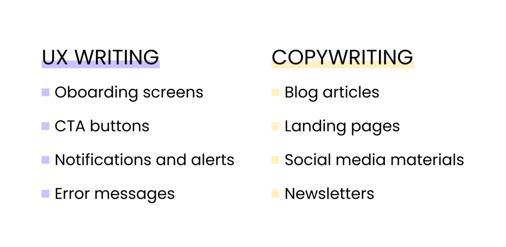
UX writing focuses on enhancing the user experience by providing clear, concise, and contextually relevant text that guides users through interfaces and digital interactions. It’s about seamlessly integrating words with design to facilitate usability.
On the other hand, copywriting is primarily concerned with persuasive and marketing-oriented content creation. It aims to captivate and persuade the audience to take specific actions, such as purchasing, subscribing, or engaging with a brand.
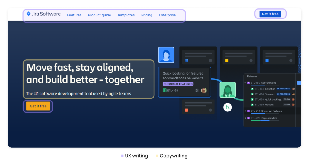
While UX writing seeks to simplify and facilitate user interactions, copywriting aims to evoke emotions, spark interest, and drive conversions.
Microcopy and macrocopy
Microcopy and macrocopy are terms used in the context of UX design and content creation. They refer to different types of content in digital interfaces. Microcopy ensures that users can smoothly interact with digital interfaces, while macrocopy shapes the overall messaging, tone, and communication strategy to drive deeper engagement.
Microcopy
Microcopy refers to short snippets of text that are strategically placed throughout digital interfaces to guide users and improve their experience. These tiny bits of text can be found in buttons, labels, error messages, tooltips, form fields, and other interactive elements.
Microcopy is crucial in providing clear instructions and offering context to users as they navigate through a digital platform.
Macrocopy
We also differ in macrocopy, which refers to the larger pieces of content that communicate broader messages and deliver context to the audience. This type of copy is typically found in instructions, thank you messages, product descriptions, purchase confirmation pages, and other longer-form content. Macrocopy has more space to convey detailed information, tell stories, or persuade the audience.
Where and how to use UX writing?
UX writing finds its application across various touchpoints within digital interfaces. Here is how and where to effectively apply UX writing.
Onboardings and welcome pages
As users first interact with your product or platform, UX writing can guide them through onboarding. It introduces functionalities, sets expectations, and familiarizes users with key features, making their initial experience smooth and empowering.

What is essential to make users comfortable as they begin their journey with a new product?
- Clear communication of values that users gain from the product.
- Step-by-step instructions on how to get started.
- Visualizations such as icons and images to complete the text.
- Positive language to motivate users. Encouraging them to explore the product.
- If possible, personalized onboarding experience based on user preferences.
- Storytelling to connect with customers and present them with the value your product brings to their lives.
Buttons and labels
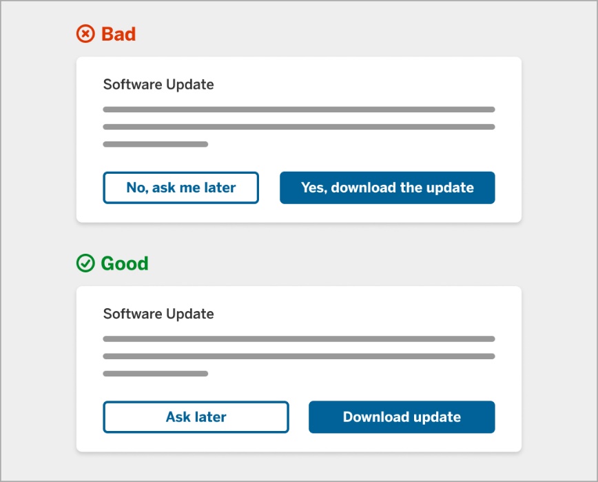
Microcopy on buttons and labels directs users on what actions to take. Use clear, action-oriented text that will not confuse the users. Button labels should lead the user to act with action verbs, e.g., “Add to cart,” “Buy,” “Save,” “Download,” and “Publish.”
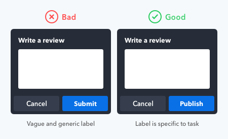
Ensure the text reflects the context of the user’s current task or situation. If the button initiates a specific action, the text should indicate that action.
Keep button texts concise and to the point. Longer text may be less scannable.
Error messages and notifications
Friendly, empathetic error messages help users understand their issues and provide potential solutions.
Do not just state an error occurred. Offer guidance and assure users you’re there to help them resolve the problem.
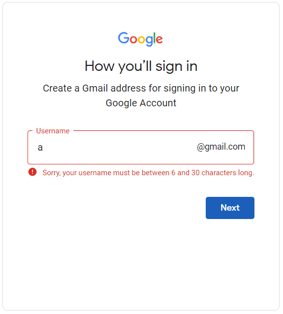
When you create error messages, remember about those few principles (source: Whitespace)
- Provide feedback on user actions and updates on system status.
- Prevent errors before they occur.
- Provide easy error recovery.
- Use clear and consistent communication.
Provide access to more details when needed.
Tooltips and help text
Tooltips and contextual help text provide additional information about specific elements or features, offering quick assistance without overwhelming users.

Effective tooltips are always necessary, benefit-oriented, concise, and relevant.
Here is a tooltip that does not bring any value:
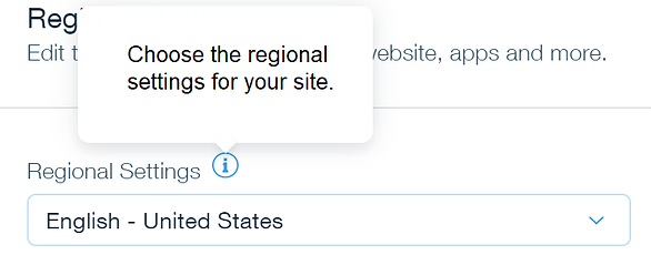
Avoid redundant text that is not beneficial for the users. Tooltips should be helpful and highlight the benefits.
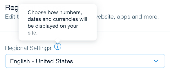
Now, the tooltip offers more information, and users can understand how this setting works in the service.
Forms and input fields
In forms, UX writing clarifies what information is needed and provides validation messages in real time, helping users complete forms accurately and efficiently.
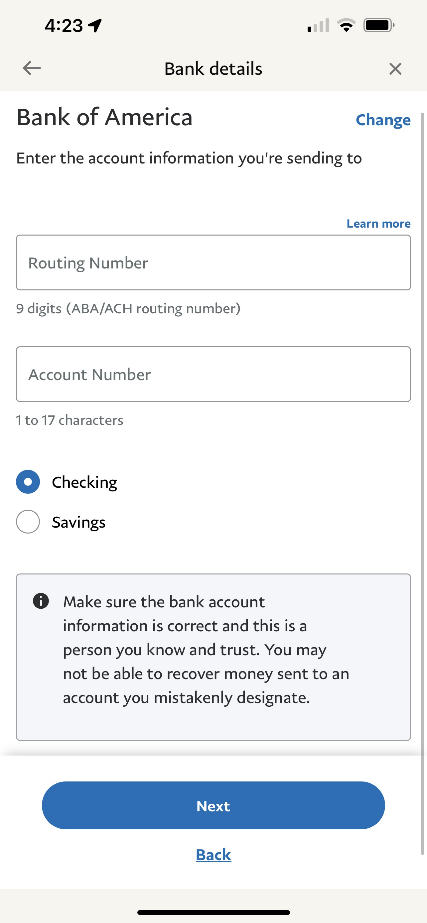
Here is an example of presenting useful information in PayPal’s mobile application. A non-error label with an info icon provides important information to users.
What can you do to make forms effective?
- Provide clarity for the user.
- Show progress.
- Use multi-step forms when necessary.
- Use specific, actionable CTA.
- In-line validation messages.
Interesting statistics about forms
According to Wpforms, removing even one form field can increase form conversions by up to 26%. In 2019, the average web form length consisted of 5 fields, which typically results in the highest conversion rates. Limiting the number of fields to 3 may reduce the form abandonment rates.
One of the most negative fields in the form is asking for their phone number. 37% of people will abandon the form asking for a phone number unless the field is optional.
Empty states
When users encounter empty sections (like an inbox with no messages), UX writing can guide them on what to do next. Use encouraging language and actionable suggestions to prompt engagement.
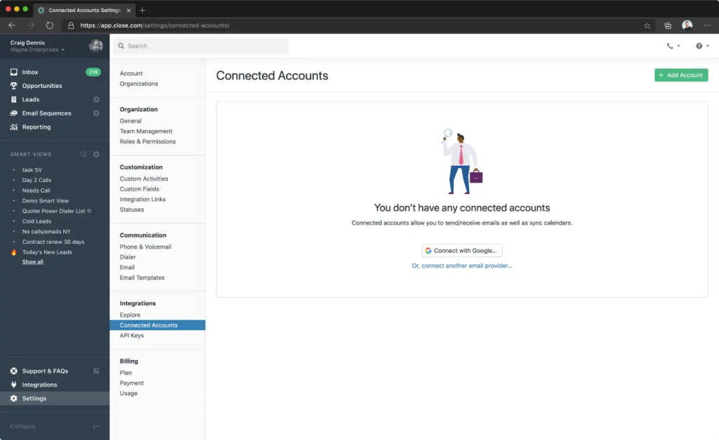
Tips to design effective empty states:
- Use the empty state to explain the purpose of your product or section in the application.
- Suggest actions the user can take to add content in the corresponding input section.
- Keep the empty state simple with the key message.
You can add a title and a simple image to suggest the action that the user can take.
Calls to action (CTAs)
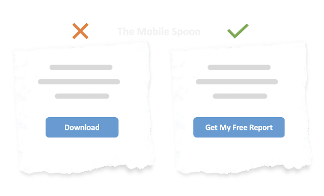
Effective CTAs combine compelling copy with a visually appealing design. UX writing here should entice users to take desired actions, emphasizing the value they’ll gain.
Pay attention to the action button and write specific labels. Try to highlight the value of the action or provide a brief benefit statement. Use solid and action-oriented words and show a specific goal.
Navigation and menus
Navigation menus benefit from clear and concise labels that guide users to their desired destinations. Prioritize clarity over creativity to prevent confusion.

Frame labels from the user’s perspective. Use terms that reflect how users think about the content or actions they’re looking for. Focus on benefits and outcomes rather than system-oriented terminology.
Feedback and success messages
Our interactions with digital products evoke a range of positive and negative emotions. Users are more likely to continue interacting with the product when they receive positive reinforcement. This can lead to increased usage and engagement.
Acknowledge user actions with positive feedback. When users successfully complete a task, a well-crafted message boosts their confidence and ability to navigate and interact with your product.
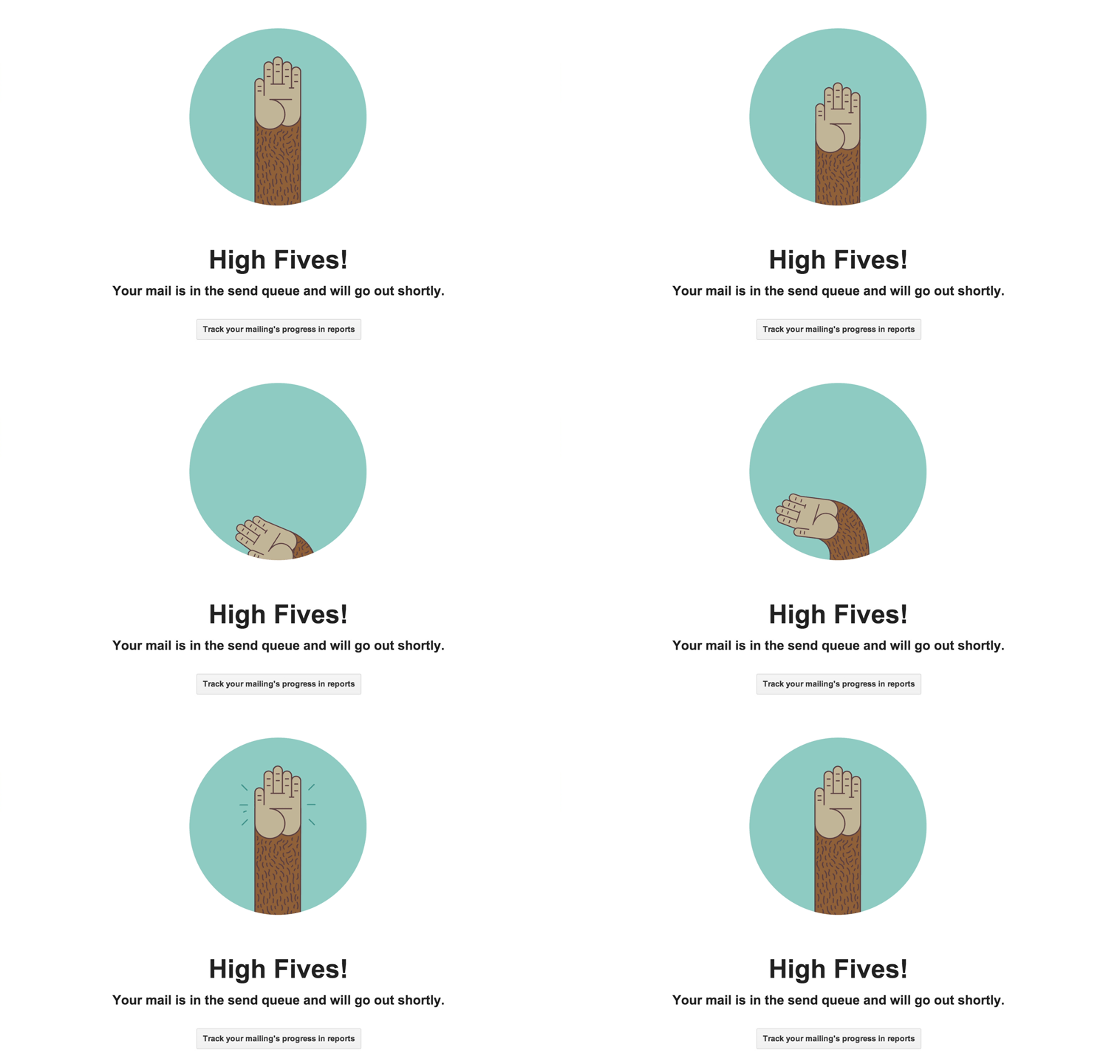
Positive feedback reassures users that they are using the product correctly. Without feedback, users might wonder whether their actions were registered or if an error occurred. Clear feedback prevents confusion, as users know what’s happening in the interface.
FAQs and help centers
When users seek assistance, UX copy can simplify complex information, answering questions clearly while maintaining a helpful and friendly tone.
Here are some tips for creating helpful content:
- Frame your content from the perspective of the user. Use language that is familiar, simple, and aligns with the way users phrase their questions.
- Start with the most common questions users are likely to have. Addressing these early on can save users time and frustration.
- Categorize questions into categories or topics. This makes it easier for users to find relevant information and navigate the content.
- If possible, provide real-world examples to illustrate your answers. This helps users understand how the information applies to their situations.
- Use consistent terminology and phrasing throughout your FAQs. This avoids confusion and reinforces your brand’s voice.
- For processes or tasks, provide clear step-by-step instructions. Break down complex tasks into manageable actions.
Push notifications and alerts
Notifications can boost user engagement by encouraging them to take immediate action, such as opening an app, visiting a website, or making a purchase. Push notifications effectively send reminders about events, appointments, deadlines, or abandoned carts. By keeping users informed and engaged, notifications and alerts may help improve customer retention and prevent churn.
Please remember to don’t overwhelm users with excessive notifications. Be selective and send messages that truly provide value.

Main principles for UX writing
Effective UX writing is guided by fundamental principles that ensure clear communication and enhanced user experiences. Here are some of the most important rules to follow (Source: LinkedIn).
Understand your audience
Before you write copy, you must know who will use your platform or product. You need to understand users’ goals, pain points, and emotions. UX research tools help with knowing this information. You can define voice and tone if you know what users need and expect from the product.

Define voice and tone
Voice and tone point to the personality and attitude of the copy. They reflect the product values and brand identity. More about defining voice and tone.
Voice refers to your copy’s consistent personality, style, and character. It’s the unique way you express your thoughts and ideas. A strong and consistent voice helps establish your brand identity and connects with the target audience. Different brands, individuals, or contexts might have different voices. For example, a brand targeting a youthful audience might have a playful and informal voice, while a financial institution might adopt a more formal and authoritative voice.
Tone is the emotional quality or attitude expressed in your writing. It’s how your voice adapts to different situations, emotions, and contexts. Your tone can be friendly, formal, authoritative, empathetic, humorous, serious, and more. The tone you choose should align with the purpose of your content and the feelings you want to evoke in your readers.
Clarity
Use straightforward and easily understandable language. Avoid jargon, technical terms, and ambiguity that might confuse users.
Use plain language
Use familiar terms that users can quickly understand. Even experts in any given field prefer to read texts in plain language. If there is a need to mention technical details, they can be placed in a troubleshooting section, and the user can be directed so that he can resolve the issue quickly.
The reason for login failure is unclear to the user in the example below. We can provide a more clear message with the solution.

In the following example, we have a long message with unnecessary details. We also blame the user for entering the wrong email address. The corrected message is precise and explains the correct email format to the user.

Products or platforms should aim to reduce the word count as much as possible while maintaining clarity.
Make content scannable
Research shows that users don’t primarily read web content. Users want to perform tasks or find the information quickly, so they scan the content and look for clues in the text. We need to remember to format the texts and understand the reading patterns. Another thing is to avoid upper case text because this lowers the scannability and gives an impact of shouting on the user. To read more on this topic, see the article.
Conciseness
Keep your text brief and to the point. Use the fewest words possible to convey the necessary information without sacrificing clarity. Avoid redundancies and repetitions that do not add value to your texts.
The message below consists of filler words that offer no value to the user. The message is too wordy and less scannable for the user. The corrected message gets straight to the point without extra words.

Consistency
Maintain a consistent voice and tone throughout the interface. This helps create a cohesive and unified user experience. The same style and terminology also help users to navigate more efficiently.
Consistent use of terms and names reduces user uncertainty.
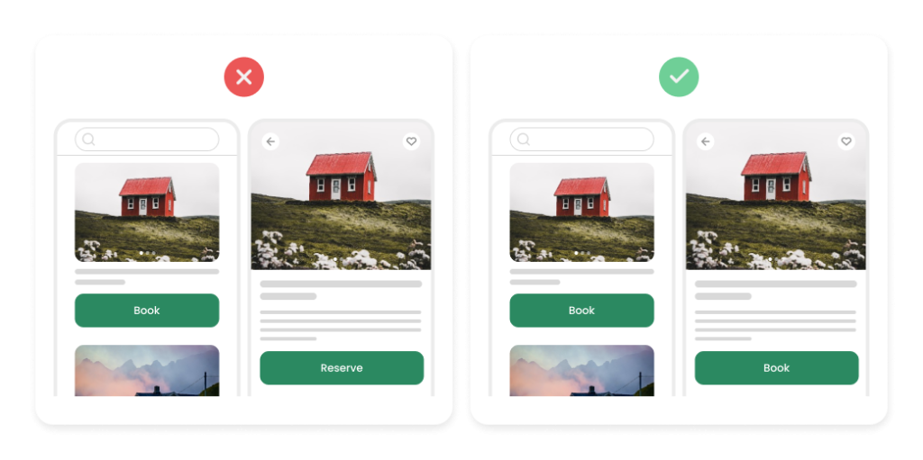
If you use “Book” in one part of the application and “Reserve” in another, users will waste time looking for differences instead of achieving their goals.
UX copy documentation helps in daily writers’ work. Use a glossary and checklist to ensure your UX copy is consistent with the style guide. The documentation does not need to be fancy. Collect every copy you crafted and mention the context when the term appears.
Empathy
UX writers need to know the users and understand their perspective. You need to be part of the user research process to see how the users speak and what they feel. Human-like language and empathetic texts that resonate with users are used to create the most positive emotions.
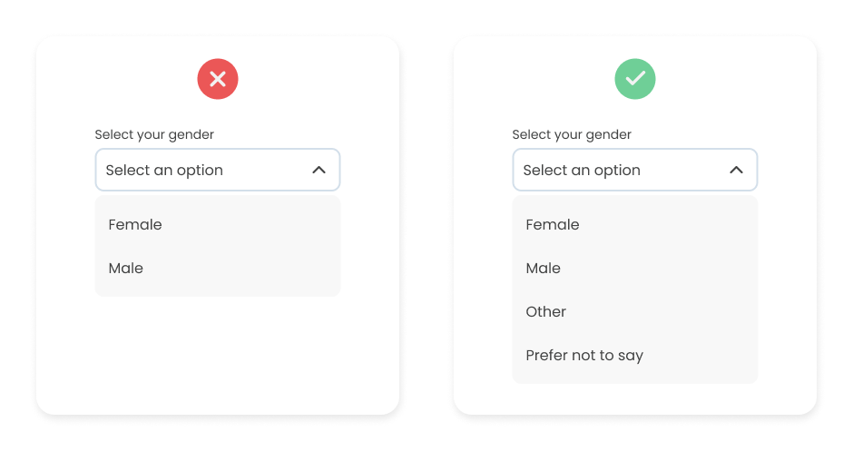
Your copy should be accessible to all readers. Do not forget about inclusivity. In the example below, the form has only two options. The last thing we want is for someone to feel uncomfortable. Always give more than two options. Ideally, this kind of field should be optional.
Check this article to see more inclusive design principles for platforms and applications.
Context
Adapt the writing style to fit the platform and user behavior. Ensure that your text provides relevant information at the right moment and doesn’t overwhelm users with unnecessary details.
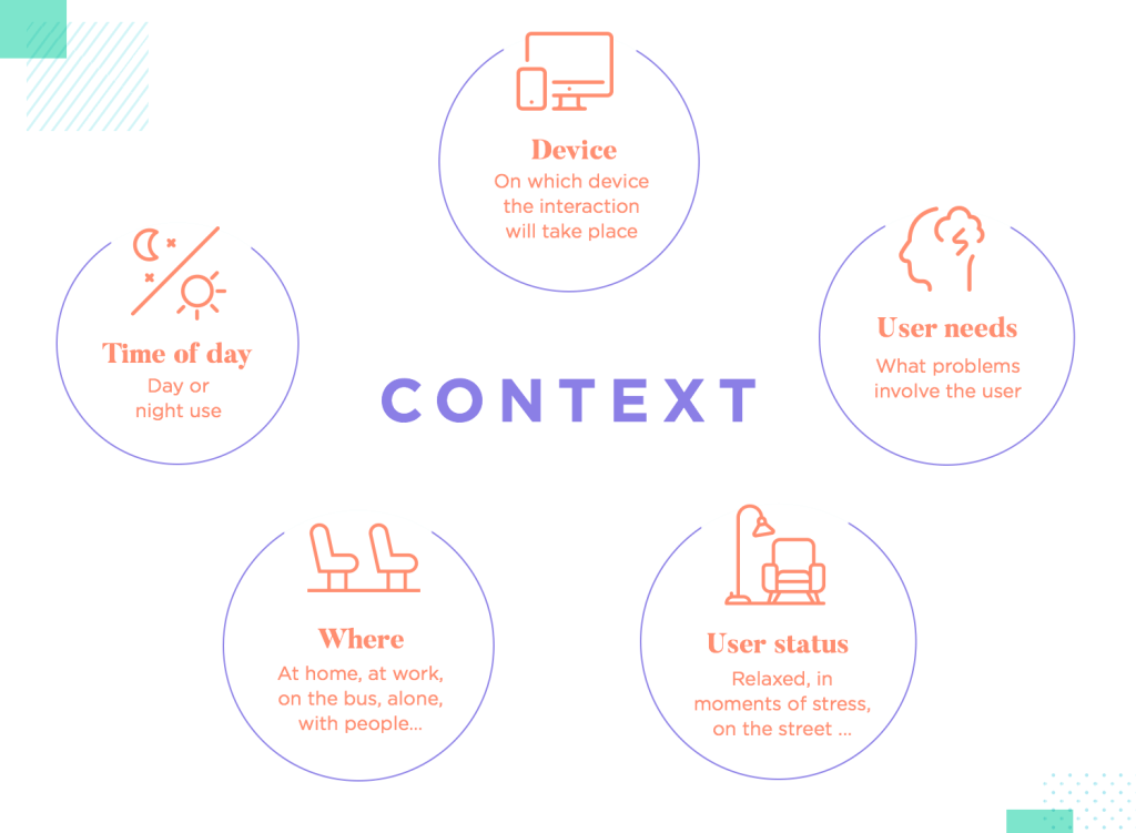
Relevant content reduces cognitive load by providing users with precisely what they need. This eliminates the need for users to search for information or make assumptions.
Tools that can help
Check you texts
I strongly recommend applications measuring the intelligibility of the text. The main purpose of these apps is to check the readability and grammar. If you write in English, you can use:
If you write in Polish, you can use the equivalents:
These applications analyze the language of the text we enter. It calculates several indicators that show the degree of its difficulty, e.g., the average length of sentences or the percentage of participles. It also highlights words that may be too difficult for the recipient, such as sentences that are too long and paragraphs that are the most difficult.
You can also use Grammarly, the most well-known app for grammar and spell-checking. Grammarly also offers other features in the free version. Performance metrics like readability and vocabulary offer help for text creation.
Collaborate with the team
Collaboration is key in UX writing, and tools like Google Workspace, Microsoft 365, and Slack enable seamless communication and collaborative document editing among team members.
UX writers often collaborate closely with designers to integrate text into interfaces. Tools like Figma or Adobe XD facilitate the integration of text within prototypes, allowing writers to visualize their content in the design context.
Virtual tables like Miro or FigJam are often used as brainstorming spaces or places to organize information and create mind maps.
Summary
Good UX writing is often “transparent” – as users, we do not notice it because it is understandable, leaves no room for doubt, and does not require reflection on our part. Good microcopy often translates to higher conversions. A user who receives relevant tips while navigating a website or application is likelier to create an account, place an order, or fill out a form.
Well-crafted texts also allow you to relieve the customer service department. The reason is simple: users who receive all the information they need, formulated clearly, do not need to seek help from consultants.
It is worth remembering that the content in UX writing should be adapted to the specific target group and the context in which it is used. Being clear, concise, and empathetic is key to ensuring user comfort and understanding when interacting with your product or service.
UX writing is not just about words but about creating a seamless bridge between design and communication to enhance user experiences during every interaction.
***
If you are interested in the area of UX, be sure to also take a look at other articles by our experts.


Leave a comment