Looking at Shopify’s valuation on the US stock exchange or LPP’s (CEE largest retailer, employing more than 20 000 people) approach to its stationary stores, it’s hard not to notice the growing importance of e-commerce. On the Internet – just as in the real world – many factors impact our shopping experience.
UX, design, and performance are the key elements which importance are crucial in both online and standard shopping. Each of these topics is so extensive it could be covered in a separate book. Such has already been written. Therefore, I will try to indicate the most important elements of each of them, within my knowledge. I do not intend to thoroughly analyse each of the raised topics, because I am neither an expert in any of these areas nor the form of the article allows for such a comprehensive study. The purpose of this article is to introduce the developer to the potential problems he or she may face in the main areas of modern e-commerce.
At the beginning, I’d like to discuss a buzzword that’s becoming more and more talked about, especially in the context of e-commerce.
Headless e-commerce
What exactly is headless e-commerce? It is e-commerce where each layer is implemented independently of each other, and the binder of these layers is their API. From an end-user perspective, the potential difference can be perceived mainly in the performance of the application. However, looking at the available functionalities, headless e-commerce is no different from “regular” e-commerce. At this point, we can ask ourselves a question – what are the advantages of headless approach in comparison to traditional, “monolithic” one?
Advantages
High service performance is easier to realize
When building webshops based on the “back-end rules them all” principle, it is much harder to achieve the high performance of an application. It happens because of, among other things, the complexity of the back-end architecture, which must also handle the front-end and the cache layer. On the back-end, we usually use additional caching tools like Varnish, Redis or Elasticsearch to keep the results of individual queries in memory.
Using headless approach, we can easily generate any subpage as a static one, which view is not dependent on user status (logged in/guest). Static page makes user wait only for “clean” HTML and CSS to load. For e-commerce, this approach works mainly because in this domain the main significant difference for users is the content of their shopping cart. From an UX perspective, there is no need to download shopping cart along with the content of the entire site – it can be downloaded dynamically after the user enters the website. That is why static pages are the best solution for e-commerce.
At this point, a question about cache invalidation may come up. After all, static pages will not update. Here is another good news for those concerned. Modern front-end frameworks such as NextJS or Remix use the SWR (StaleWhileRevalidate) pattern. In a nutshell, it means that cache invalidation takes place “underneath”, after a time interval we specify. In the meantime, users get the version of the page saved in the cache. This solution also allows us to resign from Varnish, which simplifies our system and relieves the back-end developers.
Smaller scope of technologies required from a single developer
f the service we are writing is based on a back-end that also renders the front-end, it is practically impossible for a front-end developer not to know the technologies used on the back-end. For example – when writing the front-end layer in Magento 2, we need to know the structure of the xml file required by Magento, we need to know what entries to add to each xml file and where to place them. In places where in JavaScript we would like to use data passed directly from the back-end, we are forced to understand the entire MVC structure behind Magento. Of course, behind all this comes the necessity of the knowledge of PHP. And this additional overhead absolutely does not compensate for the required front-end knowledge.
With the headless approach, front-end developer only needs to know the front-end technology. That’s it.
Greater flexibility in the choice of technology
When working on a headless site (whether it is e-commerce or not), we have more freedom over the choice of tools to accomplish the task, whether it is front-end or back-end. The only thing that binds the two layers together is the structure and the way (SOAP, REST, GraphQL) data is transmitted. Looking at the architecture as a whole, back-end is its foundation. From a front-end developer’s perspective, in headless approach, the back-end is an implementation detail. In this case, you can easily replace the technology anywhere or add a new microservice based on a completely different language or framework.
Ability to develop individual layers independently of each other
Because of the flexibility that headless e-commerce gives us, none of the layers are blocked by another. You can easily implement deployments of individual layers, completely independent of each other. This also allows us to easier iterate design changes.
Disadvantages
The need to integrate additional tools
In complex systems, we can expect a lot of built-in functionality, such as i.e. analytics or CMS. Of course, this is the cost that has to be borne in case of their implementation in the headless approach. At this point, you have to answer the questions: if the tools available in the “monolith” are needed, if they are sufficient, if the development will be fast enough and what kind of developers we have at our disposal.
Summary
The differences I have mentioned are the ones that are easiest to indicate. As for the difference in costs, for example, this is hard to estimate. Costs consist of both the size of the team and the time they spend on the project. The size of the team in a headless approach can be exactly the same as in a traditional approach. As for the lead time – theoretically, it can also be the same in both cases. In practice, however, I noticed that the headless approach sped up development significantly. This was mainly due to smaller overhead caused by the need for back-end knowledge.
Three pillars of modern front-end
It’s time to discuss topics that in my opinion should be addressed when creating a front-end layer. The scope of each of them goes far beyond e-commerce as well as front-end. Below I will try to discuss these points in the context of creating an online shop
1. UX
UX stands for user experience, or what the user experiences – in this case in our online shop. UX in itself is a broad topic, far beyond e-commerce, but in e-commerce itself, it is an essential element for a high conversion rate.
Non-responsive design, complicated navigation, impractical positioning of icons, lack of default and widely used keyboard shortcuts (e.g. ESC key to disable a modal), screen “freeze” when loading particular actions, menu, which takes up practically the whole page when hovered over, so it is impossible to “unhover” it, no possibility to return to the same place on the list of products after entering a single product – these are just some of the UX sins, of which at least one can be found in every online shop.
While in most cases, one or two errors do not cause a disaster, their accumulation can be critical. In extreme cases, it can lead to an increase of up to 73% in the number of users leaving our website (https://baymard.com/research/ecommerce-product-lists).
Filtering on product listing
Filtering on the product listing is one of the critical points of our application. The last thing we want to show the user is a screen without any product. Of course, UX in this case has to be just as good on desktop as on mobile screens
- Poor
The following example of a clothes shop can be used as an example of poor UX when filtering products.
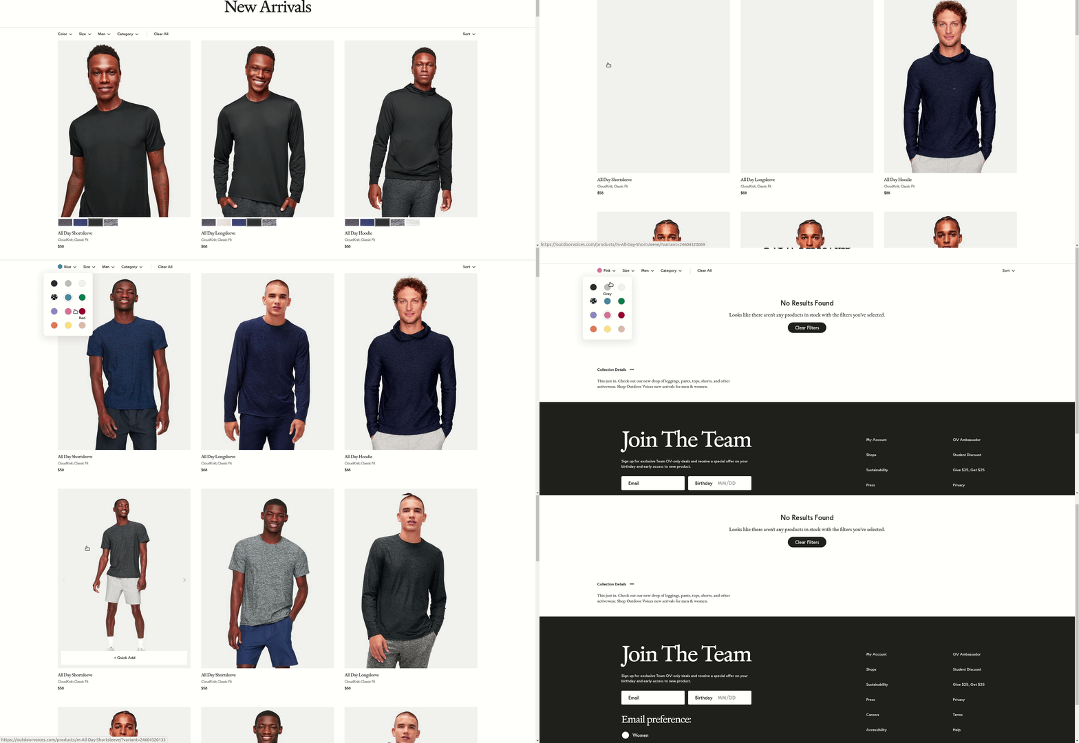
First of all, there is no possibility to select several values of the same type. We do not have the option to display products in grey or green at the same time. There is also no information about the number of products. As a result, when choosing orange tops in size XS to wear outdoors, we get such a screen:
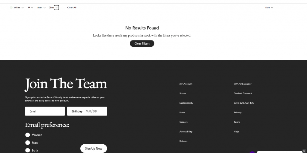
Choosing the “New Arrivals for men” screen is actually entering new products with the “men” option selected. As the filters are not dependent on each other, in New Arrivals we have the option to filter by “bras”. The number of filters is really small. For example, there is not even the most basic price filter. In addition, sorting by price can only be done in ascending order. On the plus side (?) the fact that due to the speed of operation (and lack of possibility to select several options from the same type of filter), it does not bother so much that the products reload immediately after selecting an option. In the case when we would like to select several options and after selecting each one we would have to wait a few seconds, surely many users would leave the site during the filtering process.
- A little bit better
Another representative of the clothing industry looks a little bit better.
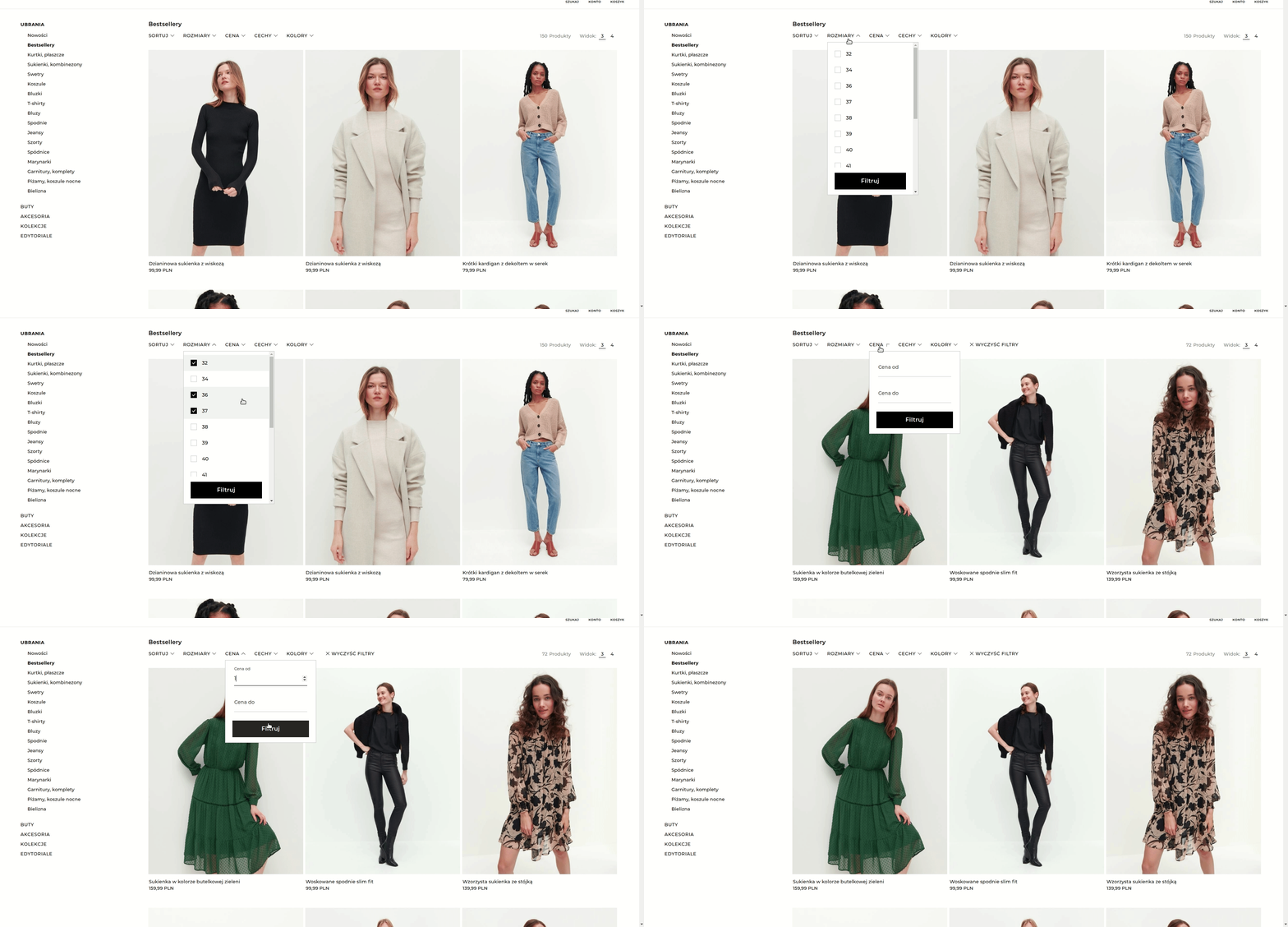
However, this shop has not been spared a few mistakes either. First of all, when we present the price filter, it is good to fill in the upper and lower range right away. It would be advisable to validate these numbers because we can enter such a high lower price or such a low upper price that we get a screen without any products.
A screen without a single product is generally a problematic element in this shop. We have too many options that lead us to it. For example, in the men’s jumper category we can select size M and the feature “with hood” which ends up with no results:
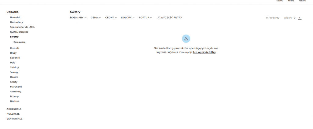
There are, of course, many more such combinations. Another disadvantage is the fact that after selecting filters, user is nowhere presented with information about the options selected. To find out, a user has to click on a given filter and go through all the options to see the selected ones.
Overall, product filtering performs better than its predecessor. The available options are narrowed down to the context in which we find ourselves. We can also choose several options from one type of filter. However, there is no information about the number of products in a given filter. And that miserable screen without any products…
- Much better
When it comes to filtering products, the following shop, also from the clothing sector, looks the best.
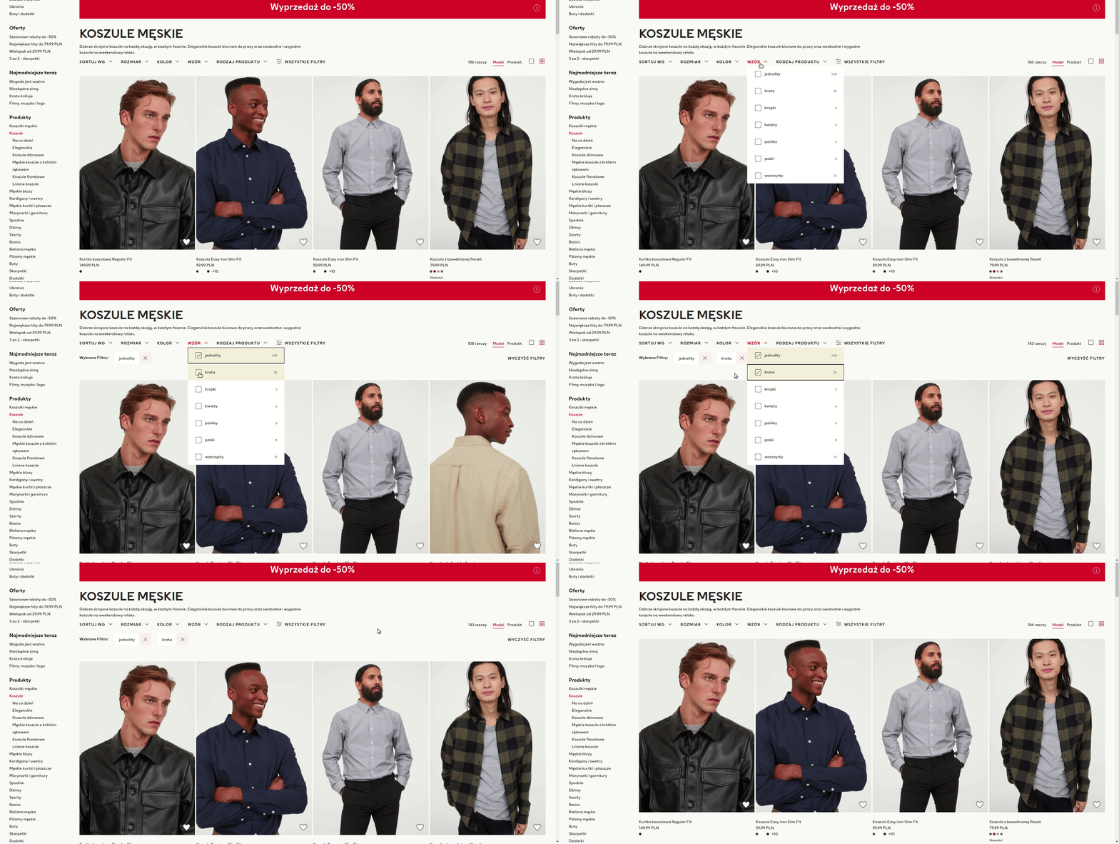
Next to each option, we can see the number of products that it contains. After selecting a value we can easily remove it. The filters are also dynamic, i.e. if we select white colour and there is no product in size L, we will not be able to select this size. This automatically removes the case of a blank screen. We have a lot of filters available, but at the beginning of the process, user only gets the most important ones. This is also a very reasonable solution.
On the minus side, we can write down the lack of a price filter. And this is despite a large number of available filters. The second nuance to improve is the fact of screen “freezing”, which occurs when selecting an option. In case of a slower response from the back-end, this may result in user frustration.
Purchase process
A purchase process is also extremely important if you care about high conversions. Almost 70% of users abandon this process just right after the products are added to their basket (https://baymard.com/lists/cart-abandonment-rate). Please think about this number for a moment. Almost 3/4 of users do not complete the purchase AFTER selecting the products! This is of course an average value that depends on many factors. However, it does not change the fact that checkout can be a critical place in our application.
The important thing about the checkout is to create a context in which the user is as focused as possible on the payment process. We do not want to distract him by showing a menu with categories, product search engine, ads or popups with a newsletter. It is also worth considering whether a chat with customer service is necessary here. The last thing we want when completing a purchase is for the customer to be half-focused on something else.
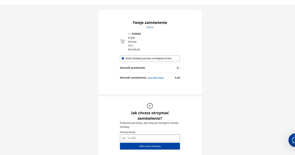
The form of a Swedish furniture shop is a good example of these practices. The customer on this site is clearly guided through the steps. There are also no special distractions on the site – only a chat with customer service remains.
- The shorter process, the better
Research also shows a correlation between the number of steps required to go through checkout and the number of dropouts (https://baymard.com/blog/checkout-flow-average-form-fields). It is therefore worth minimizing the number of clicks needed to get through the process.
At this point, Google’s payment service should be mentioned. Integration with Google Pay allows our users to reduce the number of checkout steps as much as possible. When we have connected a bank card to the Google account, and we also have the address saved there, the form looks like below:
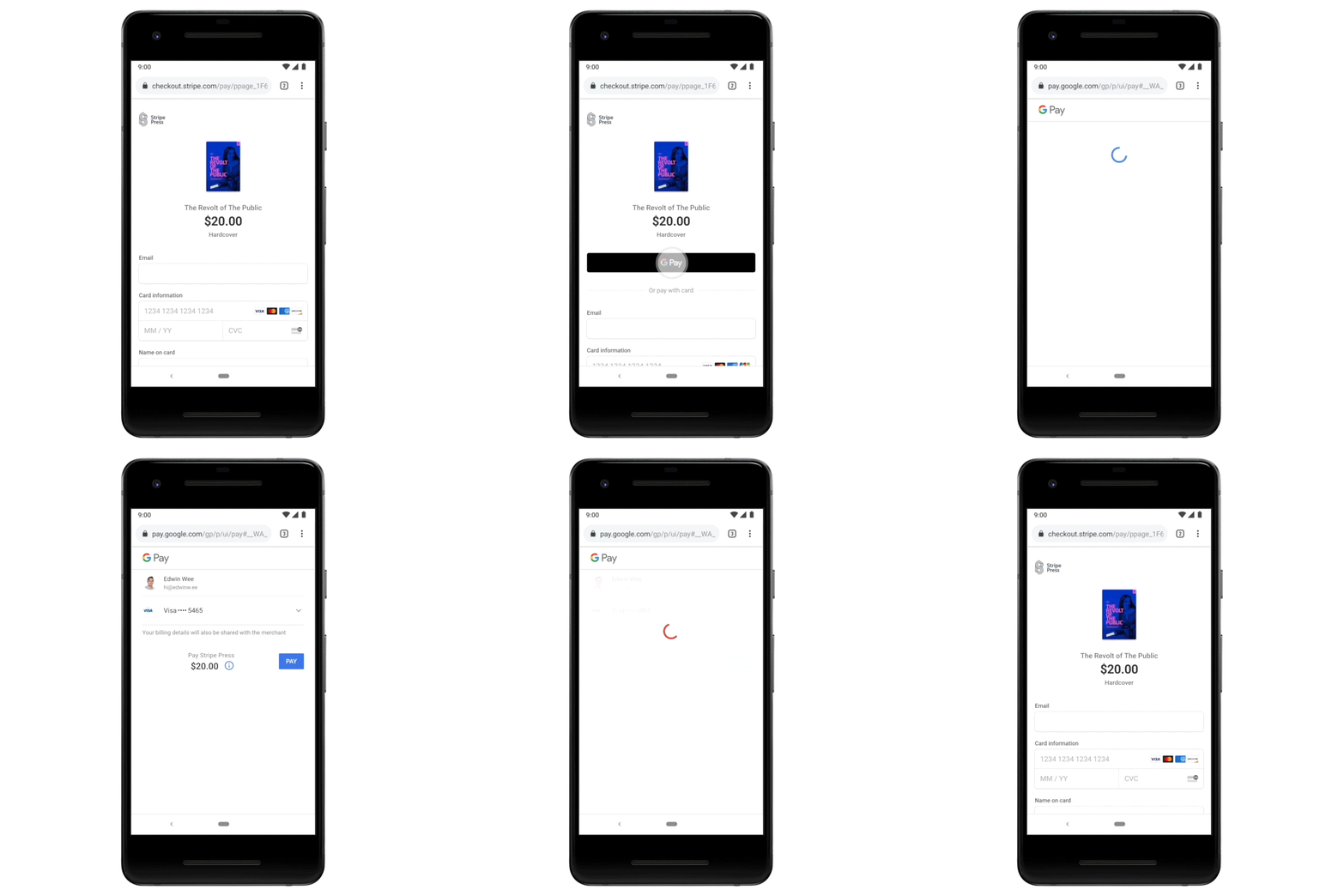
Source: https://developers.googleblog.com/2019/11/google-pay-now-available-on-stripe.html
Undoubtedly, it is hard to find even shorter process than just 2 clicks, with no additional fields to fill in.
- Other issues on checkout
For those interested in other common mistakes in the purchase process, I recommend checking out this report: https://baymard.com/blog/current-state-of-checkout-ux
Optimistic UI
Optimistic UI is an interface update that immediately shows the user positive result of the action performed. Below is a comparison of the standard behaviour and optimistic UI.
- Standard behaviour

- Optimistic behaviour
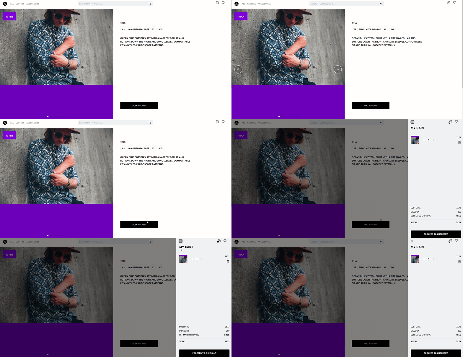
It is important to understand that the response from the server in both cases may take the same amount of time. However, an optimistic update ensures that the user does not have to wait for anything. It also allows us to reduce the number of potential loaders on the page. Of course, as usual, “with great power comes great responsibility”. We must remember to take care of all possible scenarios. For example, what if a user adds a product to the basket and changes the page before an error response is received from the server? How do we generally handle an error response? Additionally – optimistic update should not be implemented in every place, where the action called by the user requires a response from the back-end. For example, in a situation when we fill out the address form on the checkout and move on to the payment selection, it does not make sense to assume in advance that the address form was filled out correctly. This would force us into a twisted validation and complicated form flow.
Optimistic UI requires the developer to skilfully plan the structure of the local state and all the transitions that may occur in it. In the context of e-commerce, I recommend the xState library.
2. Performance
High performance is an indispensable element of any modern web application. Just like UX, it affects the revenue we gain from our shop. Performance is actually an element of UX, because how quickly individual pages load affects user perception.
The question is how important performance is. Based only on the hints from Lighthouse we can find out, among other things, that:
- Walmart saw a 1% increase in revenue for every 100ms improvement in page load

The same information I also found in relation to Amazon: https://www.gigaspaces.com/blog/amazon-found-every-100ms-of-latency-cost-them-1-in-sales/
- Rebuilding Pinterest pages for performance increased conversion rates by 15%

- If a site takes >1 second to become interactive, users lose attention, and their perception of completing the page task is broken

These facts are clear evidence that a slow page load is bound to make less money than a faster one.
How to measure performance?
- Lighthouse.
This tool, its metrics, and all the tips that are available we should know inside out. For applications using React, there is a console add-on that allows us to check the rendering time of each component. We can also check an option that causes the component to be highlighted when it renders (or rerenders).

Headless e-commerce and performance
As I’ve mentioned when describing advantages of headless e-commerce – a very important advantage of current front-end tools is the ability to generate our application to static pages. For demonstration purposes, I’m adding below out of the box performance of product listing page that was created using NextJS and Tailwind libraries, with Shopify in the back-end.
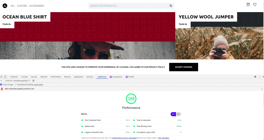
This is certainly a satisfactory result, especially considering that no special optimization tasks were performed to obtain it. I understand potential doubts as to whether the result is not fraudulent. I invite inquisitive readers to visit the website https://demo.vercel.store/, on the basis of which the page on the above screen was created. It is also worth noting that because of the static page, back-end does not play any role in the performance. This can be seen especially after entering the above demo, where BigCommerce is used as the back-end. In addition, the page generated this way can be posted on a CDN, which will help us further increase the speed load.
Images
„You can’t be a web performance expert without being an image expert.” – Tobin Titus
Nowadays, images are by far the “heaviest” content on our websites.
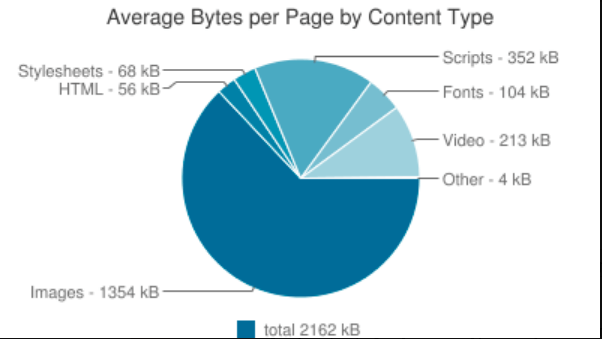
Images themselves are an extremely broad topic. Lossless compression, raster graphics, vector graphics, lazy loading, the difference between JPG and PNG, the difference between PNG and WebP – these are topics that every front-end developer should understand at least at a basic level. I am not going to present all definitions here. What is important from a developer’s perspective is to know what tools he/she has and how to address the issue of the size of their graphics.
We should focus our attention on CDN tool and all the functions it offers us in the context of images. Solutions such as imgix, cloudflare, imagekit or other similar services provide us with, among other things, automatic cropping and resizing of images. In a situation where we have a few thousand products on the website, each product has a few pictures, and each picture has to be at least in 3 sizes, probably everyone understands how much automation of this process can give, in comparison with manual resizing of each picture. Additionally, the CDN should ensure (at least in theory) fast delivery of content.
When we already have different images for different resolutions, we still have to inform browser which file to use for a given size of the browser window. To know how to do that, I recommend reading the documentation of the picture element – https://developer.mozilla.org/en-US/docs/Web/HTML/Element/picture.
Regarding lazy loading images, I recommend all developers who implement lazy loading with external libraries or their own scripts to get familiar with the “loading” attribute. More here: https://web.dev/browser-level-image-lazy-loading/
However, when we are forced to optimize images on our own, I recommend, among others, the following links:
https://www.smashingmagazine.com/2019/10/imagekit-guide-optimizing-images-mobile/
https://www.smashingmagazine.com/2009/07/clever-png-optimization-techniques/
https://www.smashingmagazine.com/2015/06/efficient-image-resizing-with-imagemagick/
Code splitting
Code splitting in other words it’s dividing files into smaller fragments, which are actually used on a given subpage. This is another important element that aims to reduce the size of uploaded files. Certainly, we do not want e.g. checkout validation to load on the product listing page. This is a task which implementation difficulty strongly depends on the selected tools. For example – Magento 2 has a whole page dedicated to this issue (https://devdocs.magento.com/guides/v2.4/frontend-dev-guide/themes/js-bundling.html), while I personally did not notice any improvement by following this advice. Interesting fact – Lighthouse in its tips suggests using “bundler” tool for code splitting in Magento 2 (https://github.com/magento/baler/). As we can see in the documentation – this tool is in Alpha phase and the last commit is from 9 months ago (as of 10.12.2020). I understand at this point the powerlessness of the developer. I can’t help but sympathize and recommend the headless approach.
When we have a possibility to choose tools, I recommend webpack, and especially this part of its documentation: https://webpack.js.org/guides/code-splitting/. There is all the information about how to implement code splitting and about potential problems related to code duplication.
If we are writing a front-end layer that is not a standalone application, an important attribute that we can add to our scripts is “defer”. It allows us to execute the script when the browser has finished parsing the page. More about this attribute here: https://developer.mozilla.org/en-US/docs/Web/HTML/Element/script.
Javascript also allows dynamic imports, which are shown in the link to webpack documentation. This way we can “defer” importing a particular module until it is actually used.
PS. NextJS supports dynamic imports out of the box.
PPS. While writing this article, a new (yet experimental) feature has appeared in React. These are Server Components (https://reactjs.org/blog/2020/12/21/data-fetching-with-react-server-components.html). I recommend getting acquainted with the concept due to the fact that – in a nutshell – their potential implementation (once they come out of beta) will allow us to reduce the size of files sent to the browser.
Tree shaking
Tree shaking is nothing more than eliminating code that is not used. Less code means smaller files the user has to download, and smaller files mean faster page load speed, of course. Most modern tools have built-in support for detecting such code (webpack has supported this since version 2), but it is worth bearing this in mind when using custom solutions. It is also important to remember about unused imports, while linter will help us solve this problem.
3. Design
Let me start by saying that I am absolutely not a design expert. I am not going to write about what gives brand recognition or when it is worth going off the grid. But I do understand the value of design, and it is important that the engineers working on the project also understand it. Fundamental and yet often overlooked aspect of developers’ work is understanding the business value. At this point, I would just like to cite two studies on the correlation between design and company revenue.
McKinsey
A study by McKinsey (https://www.mckinsey.com) aimed to determine what was the difference in revenues of companies that focused on design and how their shareholders benefited. Chart with link to a detailed description of the study below.
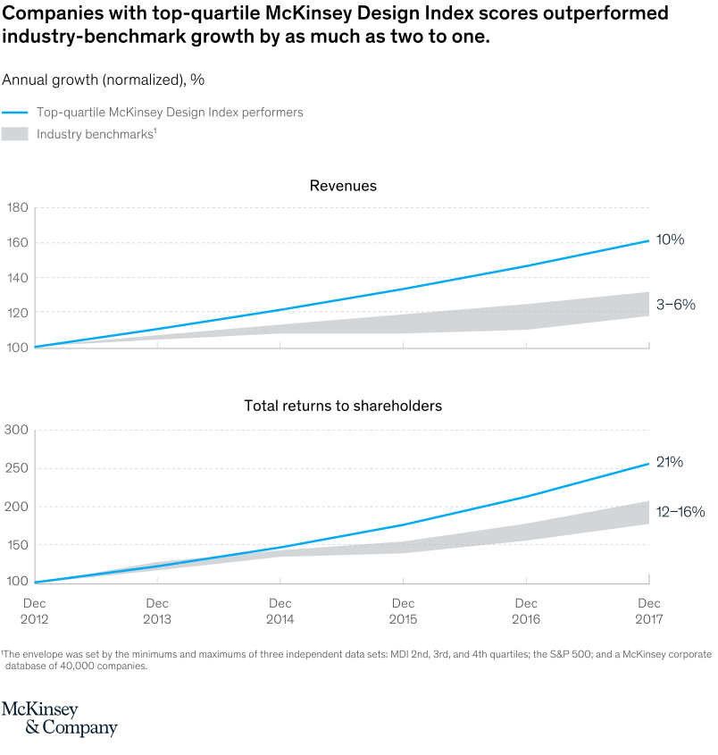
McKinsey presents its research as the most comprehensive and rigorous study at the time, focused on identifying the value of design. The report covers a 5-year period for 300 companies, in various countries and industries. As I wrote in the introduction – it is not my purpose to paraphrase a foreign-language article, so for an in-depth analysis, I refer all interested parties directly to the link. Looking at the graph, however, it is clear that the revenues of companies that considered design to be an overriding value grew at a much faster rate.
The Design Council
In 2005, a group called The Design Council (https://www.designcouncil.org.uk/) studied companies from the FTSE 100 – the 100 largest companies listed on the London Stock Exchange. From this index, they selected 61 companies for which design was an overriding value and created their own index. Below is a graph showing how the entire FTSE 100 index and the index of companies created by The Design Council have changed over 10 years.
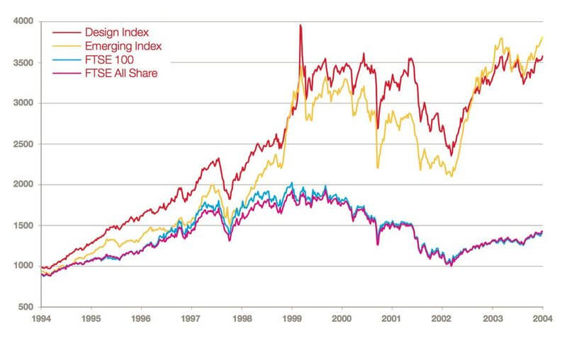
The chart shows a hypothetical situation where we invest £1,000 in the indexes shown. As you can see, the money invested in the pro-design companies has allowed them to perform more than twice as well as if that money had been invested in the FTSE 100 Index. This, in a nutshell, shows how well these companies have performed compared to the others.
Few words about cooperation with designers
In the context of a front-end developer’s work, it is incredibly important to maintain systematic design. Endless feedback, consisting in moving “a pixel to the right” or “darkening this colour a bit” is a nightmare for every person working on a given project.
Configuring the right colour palette, spacing, fonts, and grid will allow us to significantly reduce potential feedback. Additionally, it creates a common language, which the developer communicates with the designer. In such circumstances, it is not possible to move a section or component “further down”. What remains is to use a predefined spacing or force the designer to create a new one.
When it comes to specific tools to implement this structure, there are plenty of them: Theme-UI, Tailwind, EmotionJS, Chakra-UI, Material-UI, BaseWeb, Primer, Styled components, Carbon, Gestalt, Spectrum, Bride, Rebass… and this is just a fragment of the list.
For a person who will have to create such a system for the first time, I suggest reviewing the Tailwind and Rebass libraries. They present different approaches when it comes to syntax, but they implement exactly the same assumptions. When we want to use Rebass, it’s worth taking into account potential problems with performance, which may appear with a large number of components on the page or with repeatedly overwritten components.
Summary
To realize the full potential of our shop, it’s essential to provide a customer with not only the merchandise they expect but also an experience they would want to return to. Creating such an experience rests on the shoulders of all those responsible for the project.
Let me reiterate that each of the above points is a separate section in itself. Topics I’ve chosen address a very narrow context of these areas and represent a subjective view of potential problems. Another developer could certainly find completely different subjects to discuss. What is undeniable, however, is that a modern front-end without the pillars mentioned above can hardly be called meeting current standards. It is an extremely hard task for a single developer to become a specialist in each of these areas. However, it is important for every developer to be aware of how crucial they are to our business even if the business itself is not fully aware of it.
Translated by Karolina Kołyszko, Analyst working at Sii.


Leave a comment