Responsive web design (RWD) is an approach to web design aimed at crafting sites to provide an optimal viewing and interaction experience, easy reading and navigation with a minimum of resizing, panning and scrolling (across a wide range of devices – from desktop computer monitors to mobile phones).
And how about images in RWD? In the past it was easy – just check what size of image you need, open Photoshop and save image “for web”, that was it. Everything changed when six years ago, Apple announced iPhone 4 and Ethan Marcotte published an article about Responsive Web Design.
Using the width property
The first idea, when everything on the website began to be “fluid”, was to specify in CSS image width to a size not larger than the screen, and for this each image should use the CSS style, as shown below:
img {
width: 100%;
height: auto;
}
The image will be responsive and scale up and down. If we don’t want it to be scaled up to be larger than its original size, then we use:
img {
max-width: 100%;
height: auto;
}
OK, but still, on each device the same image will be loaded and this will have a huge impact on the website load speed, especially on mobile devices – as we can check on a sample bitmap image (75 dpi), comparing the file size with the resolution:
| Image width | Devices | File size |
|---|---|---|
| 320px | Older phones | 40 KB |
| 480px | Newer Phones | 60 KB |
| 768px | Tablets | 110 KB |
| 960px | Desktop computers or high resolution devices | 160 KB |
Media queries
To avoid loading one image for each device, web developers started to use media queries in CSS. By using “@media” and “width” condition tags, developers where able to tell the browser, which image should be displayed on a specified viewport width/device.
For Example:
/* For width smaller than 400px: */
img {
background-image: url('ismall.jpg');
}
/* For width 400px and larger: */
@media only screen and (min-width: 400px) {
img {
background-image: url('imedium.jpg');
}
}
But again, responsive designers have settled on varying the page layout based on one variable (viewport width). When dealing with responsive images, we are really concerned with three more variables:
- image size relative to the viewport
- screen density
- file dimensions
And thinking about this, when and what knows what?
| Variable | Web developer | Browser |
|---|---|---|
| viewport width | no | yes |
| image size relative to the viewport | yes | no |
| screen density | no | yes |
| dimensions of source files | yes | no |
So wouldn’t it be nice to pass all the information to the browser ?
“SRCSET” and “SIZES”!
There is an option to use, new attributes on the <img> tag called srcset and sizes.
<img
src="small.jpg"
srcset="large.jpg 1024w, medium.jpg 640w, small.jpg 320w"
sizes="(min-width: 36em) 33.3vw, 100vw"
alt="rwd" />;
Srcset gives a suggestion, extra information, to help the browser decide, which image should be used. We simply tell the browser the things that it didin’t know. In this attribute we provide a list of images as valid, non-empty URL’s and a width descriptor (non-negative integer greater than zero, representing the image width value and small letter “w”).
srcset=”[image URL] [image width]w, [image URL] [image width]w, … etc”
The second information we want to pass to the browser is how large the image will render within our layout. For this, we have sizes.
sizes=”[media query] [length], [media query] [length], … etc”
The browser goes over each media query until it finds a matching one and uses that query’s paired length as the last piece of the source – picking puzzle: the image rendered width or relative to the viewport. In our example we pass information to a browser, so when the viewport width is greater than 36em, we use 1/3 of it, otherwise use all of it. That is a typical example of images in 3 columns on a wide screen and in one column on devices with smaller resolution screens.
So, going back to our table of what knows what, by those two attributes in an <img> tag we can pass on new information to a browser srcset = source files dimensions and sizes = image size relative to the viewport.
The biggest advantage of using srcset and sizes compared to media queries is that, when you use media queries browsers must load the associated source and as I wrote before srcset and sizes are more a suggestion and the browser can decide and optionally load smaller sources when the bandwidth is slow or expensive.
Browser support
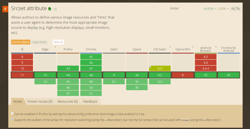
The srcset attribute has been supported in Chrome since version 34. At the time of writing, it is supported by almost all browsers. Only Opera Mini and Internet Explorer are a problem, but there are also projects like Picturefill that allow you to use these new attributes even with Internet Explorer.
Responsive lazy load
One more library worth mentioning is lazysize, which lazy loads images (including responsive images (picture/srcset)). By using it, the web developer can not only pass all the information to the browser, but also the image will be loaded when the user scrolls down the website to the point where it is placed.
<img
data-srcset="small.jpg 500w, medium.jpg 640w, big.jpg 1024w"
sizes="(min-width: 1000px) 930px, 90vw"
data-src="medium.jpg"
class="lazyload"
alt="rwd" />;
Links


Leave a comment