Apple introduced widgets for the first time in iOS 14, and with the release of iOS 16.0, widgets have been added to the Lock Screen to improve UX and usability. Widgets show the main information of an application without opening the application itself.
This article will cover the main aspects of using widgets (in particular on the Lock Screen), as well as a tutorial with a simple demo application for iOS 16 using a new type of widget.
Widget families
There are four widget families that can be displayed on unlocked device’s screen (together with apps):
- systemSmall
- systemMedium
- systemLarge
- SystemExtraLarge
And four accessory families which can be displayed Apple Watch or iOS device’s Lock Screen:
- accessoryCircle
- accessoryRectangular
- accessoryInline (contains a single text line and optional image)
- accessoryCorner (WatchOS only)
Screenshots below presents a different accessories appearance on iOS and WatchOS:
Lock screen widgets are supporting those rendering modes:
- vibrant,
- full-colour,
- accented.
For iOS, there is available only vibrant mode which provides desaturated text, images and gauges in monochrome view for widgets. Check out the official documentation to learn more.
The image below shows how the widget appearance changes when the rendering mode is changed (from full-colour to accented blue colour):
The widget family should be specific to the application and content size. An accent colour can be used to highlight the title and provide an aesthetically pleasing widget UI.
Lock Screen widgets customization and limitations
Widgets have many limitations. In Apple’s documentation, we can find that we shouldn’t consider widgets as separate apps. It’s just an extension to an existing app, and we can’t implement functions like scrolling, buttons or other interactive mechanics. It should be a simple view with text and optional images.
Building our little project and adding widgets to it, we encountered some limitations that we would like to share with you.
Constraints encountered in the project
The first of them is the size of the entries array given in getTimeline method. For example, updates will not work if the size of the array of objects of the type TimelineEntry is too large (more than about 1000), but if there are about 100 of them, then everything works as expected).
The next limitation is the frequency of updating the widget. There is a limit to updating the actual information about the widget, the update depends on the logic provided in the getTimeline method and on the budget of the widget calculated by WidgetKit. The budget is unique for each widget and the system takes into account many factors to calculate it. See the link for detailed information about the budget.
The third type of limitation is related to the UI representation of the widget. The developer must take care that the content fits correctly in the widget’s frame and all-important information is visible to the user. When adding an image to a widget, the developer must pay attention that it will take up additional space, while the size of the widget will remain the same. There is also a limit on the size of the images. Empirically, it was found out that the widget will not work with a 1200x1200px image, while it works with its small version 120x120px.
Lock Screen widget demo tutorial
For the purpose of this article, we’ve prepared a small demo app to show how widgets work and how easy is to implement one. We will focus on iOS only leaving WatchOS for another occasion.
For the beginning, please download a starter app from GitHub or clone it from provided link using Xcode 14 beta 1 or newer.
* A disclaimer here – we used Xcode 14 beta 1 to build this project and there is a small chance that something will be not working or Apple will make some changes in code for the released version of Xcode or future betas.
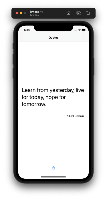
After you clone and run the project it should download quotas from the Internet and show it on devices or simulator’s screen. This app was built to show you a quotation from a simple API. You can move between quotes by scrolling down or up on the screen. If you’d like you can also share a quote using share button.
Initial preparation
After you play with the app, we can go to Xcode project and start building a simple widget that will get random quotes from API and show them on a widget outside the app. After chosen time period quotation will change for another. Let’s start.
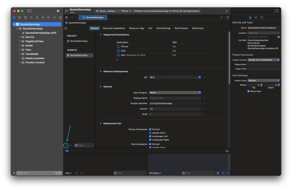
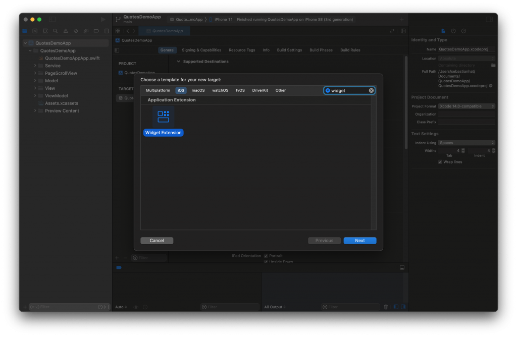
Go to project navigator and select your project name on the top. Next in general settings on the right press “+” to add a new target with widget.
Enter Product Name and do not check Include Configuration Intent, because we will not use it in this simple demo. We will use static configuration here.
Intent configuration can be used for user-configurable properties that will for example change what data will be displayed by a widget or to allow automate your app using Siri and Shortcuts. Press Next.
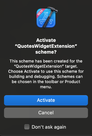
Xcode will probably ask you if you want to activate the scheme for our newly created widget for building and debugging. It is recommended to do so if we want to be able to test the code.
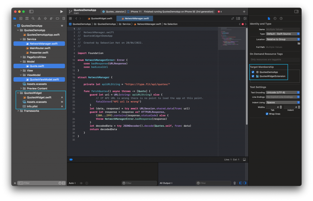
Now, we have our widget target added to the project. You can see new files on the left. I marked them with blue frame. We will get to the QuotesWidget.swift file in the moment. First select three files as shown on the screenshot above, and in File inspector on the right choose Target Membership for QuotesWidgetExtension also with QuotesDemoApp. This will allow using services, model and view model on both targets instead of creating the same files for all targets separately.
Building the widget
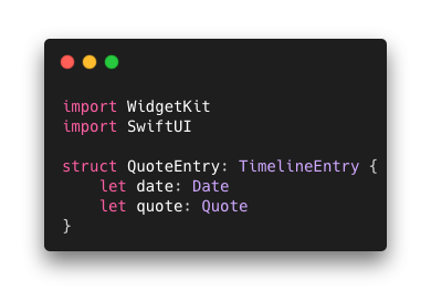
We can now focus on building our widget. Go to QuotesWidget.swift and start with changing SimpleEntry struct to QuoteEntry for better readability. We will add a “let quote: Quote” to allow widget to get our quote data for displaying it on user’s device.
Let’s look closer on QuoteEntry struct. It has to conform to TimelineEntryprotocol. Widgets on iOS can be changed during time events or user action. Those structs are created to provide data for a timeline of views to be displayed at the appropriate time.
The Provider Struct
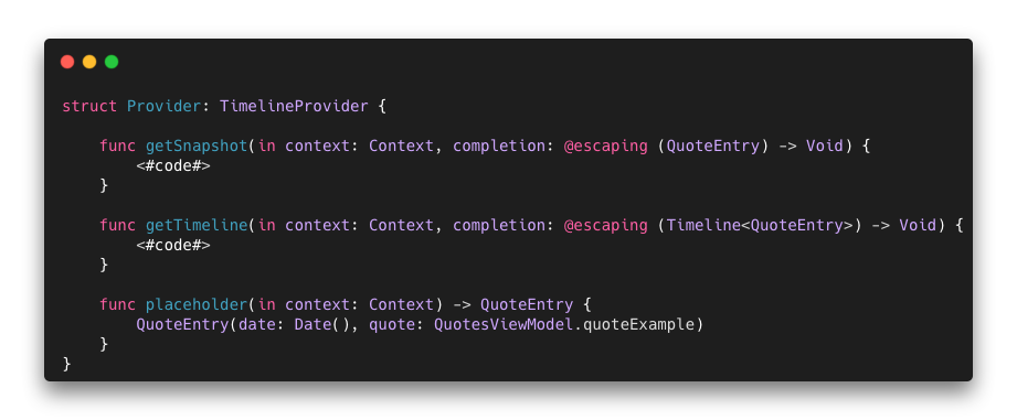
The Provider struct that conforms to TimeLineProvider protocol has three required methods that we will be using to tell widget when to send our data to the view and how to update it.
- placeholder(in: )method is providing data for widget’s placeholder UI which is the temporary content of your widget. This method is usually called when for example device’s environment changes occur like change of dynamic type setting. System may reload your widget and use placeholder data. In this case we are using example quote written in code to quickly acquire necessary data.
- getSnapshot(for: ) is used to create a single data snapshot for your widget. Snapshot is where the system needs to quickly display a single entry. Data from this method is used for example on widget gallery, when user can choose a widget to be displayed on the home screen. We’re also using an example quote here were needed fast access to data to quickly return a view.
- getTimeline(in: ) method contains an array of entries and rules when they should be displayed on widget. Timelines are a combination of views and dates that are returned, which allow you to decide at what time a particular view should be shown.
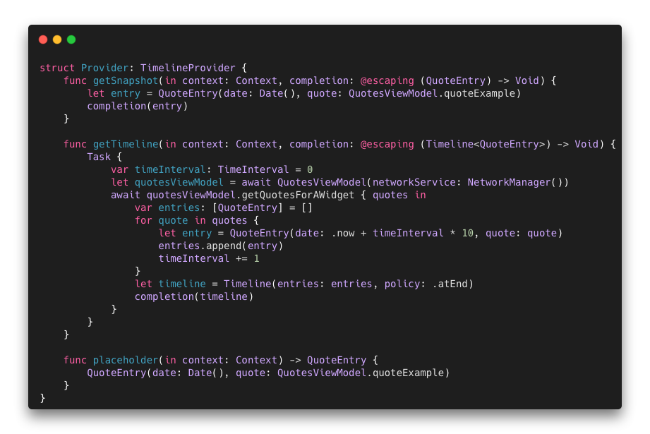
In our example we used asynchronous function running on main thread to get quotes, put them in array of QuoteEntry objects and manipulate date objects to allow widget to show a new quote every 10 seconds. Feel free to use different time interval or change the method to display quotes in a different way.
Timeline
Timelineobject from method getTimelinecreates a timeline with quote entries and a policy how to create a new timeline when actual one used the last object in the array. We can choose how new timeline gets created: after selected date, after using last entry from the array (used in this case) and after user interaction within the app.
Widget options and the view
When we created our placeholder, snapshot and timeline, we can configure widget options and the view.
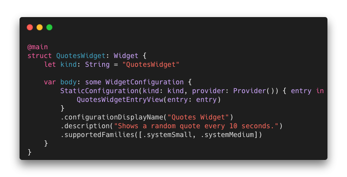
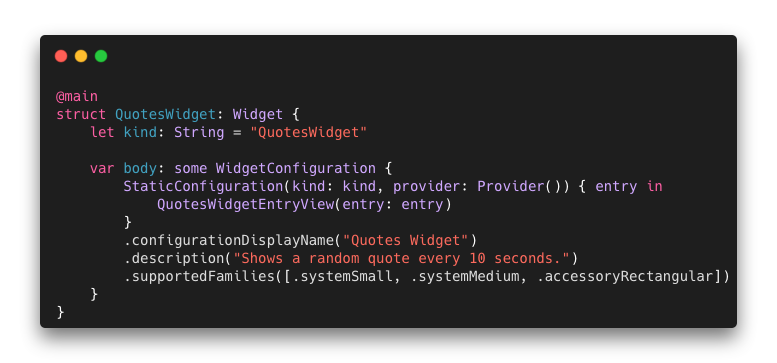
In main widget struct we can set widget’s configuration and settings. It uses configuration and provider to populate the view with data we provided earlier.
- The kind: Stringvariable is an exclusive name for this widget which should be different from our other widgets names.
- A .configurationDisplayNameshows a name of our widget on device screen.
- A .description as name suggest should be a short description what our widget is about.
- .supportedFamilies method tells the widget what sizes it should be using on main screen. We are using .systemSmall and .systemMedium to present small square widget to the user and rectangular medium size widget.
We can also use some new types for supported families that ware announced with iOS 16. We will get back to it later.
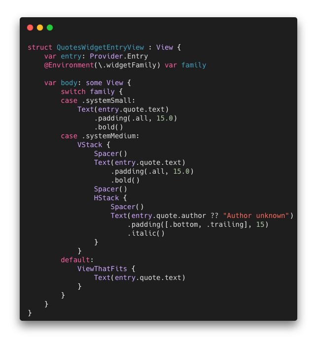
As for a view, we are using standard SwiftUI components, separate for each system family we’re using to allow rendering different components for each view. This is quite normal procedure, because different family can contain different amount of text and images.
Please, feel free to build a view for .systemLarge type of family and see how it is different from medium and small.
If you have problems with setting up the preview for a view in canvas, you can use this code above.
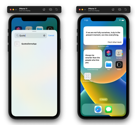
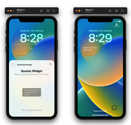
Adding new widget to the home screen
Now you can add your new widget to the home screen. If it’s not appearing in widget gallery, just put its name in a search field.
If we want to use a new API for iOS 16 that shows widgets on the lock screen, we just need to add a new family type to supported families and update the view.
A rectangular widget can display text and a small image.
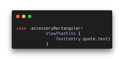
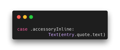
We can add a new case to our view that will be displayed on a lock screen widget.
ViewThatFits adapts to available space and use it all for children views. This way text will fill all available widget’s space.
Adding widget to the lock screen
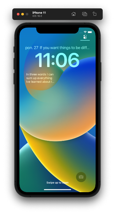
By adding .accessoryInlinewe can now add an inline widget on lock screen. This widget just shows a single line of text and an optional image at the top of the screen.
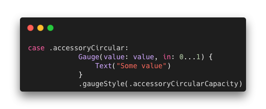
Adding .accessoryCircular allows us to use circular widgets with text, image or a new Gauge view, which we are using here.
Using a circular widget and gauge you can show a value represented in some sort of value in a declared range in a circular way or linear if we use another accessory family.
Conclusion
Apple has done a great job with widgets on the Lock Screen for iOS devices, adding improvements, personalization, and live activities. With the right approach to creation, the Lock Screen widgets can significantly improve the user experience and provide greater ease of use. As we just build a widget ourselves, we can now write that the API is very friendly to developers and easy to implement.
Many thanks to Damian Drohobycki and Marta Mazurek for an inspiration to write this article, technical review and support.








Leave a comment