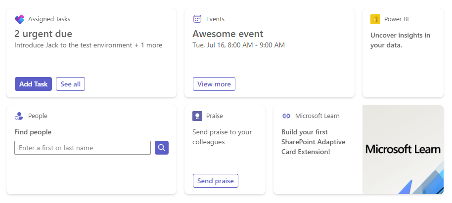
If you are a developer and have dipped your toe in Viva Connections, you may know that SPFx offers a dedicated component type for all your Viva needs – Adaptive Card Extension, aka ACE! ACE can be used in multiple scenarios, from displaying your users’ fight details or food order to rendering an image gallery. As usual, Microsoft provides a basic tutorial on building ACEs.
Even if you are an absolute #1 fan of Microsoft and follow their guidelines to the dot, you still may have some questions. Let’s tackle those doubts and create the best SPFx extension of your life!

Wait, what? How do I even create an Adaptive Card Extension?! I don’t see this option in my Yeoman!
Hey, don’t panic! Make sure your SharePoint generator is updated. Currently, it’s best if you have SPFx v1.18 installed. If you’re not sure how to check your SPFx version, you can follow Waldek’s.
While at it, you may want to look at this compatibility table to ensure that your Node.js, TypeScript, and React are also properly versioned.
The adaptive cards seem really complicated. How do I even start designing one?
Browse Microsoft samples for some inspiration or take a look at examples provided by PnP. When you find something interesting, customize it in the designer.
But don’t worry – you don’t have to copy your template to the designer whenever you want to update it! Install Microsoft’s “Adaptive Card Previewer” extension to make small changes in your Visual Studio Code.

And remember – as with many skills, practice makes perfect!
The extension’s icon doesn’t display. Am I setting it wrong?
Firstly, take a look at the Microsoft tutorial, which explains that the icon needs to be set in the solution’s manifest. Actually, I suggest configuring two properties for your icons:
- “officeFabricIconFontName” – so your solution has a nice icon in the editor’s Toolbox,
- “iconProperty” (as suggested by Microsoft) – for the card bar’s icon.
Secondly, use correct iconography. As always, you can use Fluent UI icons for the first property. For the card bar’s icon, take a look at a list of supported values.
Can you imagine a user saying that my ACE is hard to read and the images have weird backgrounds?! It looks great on my app!
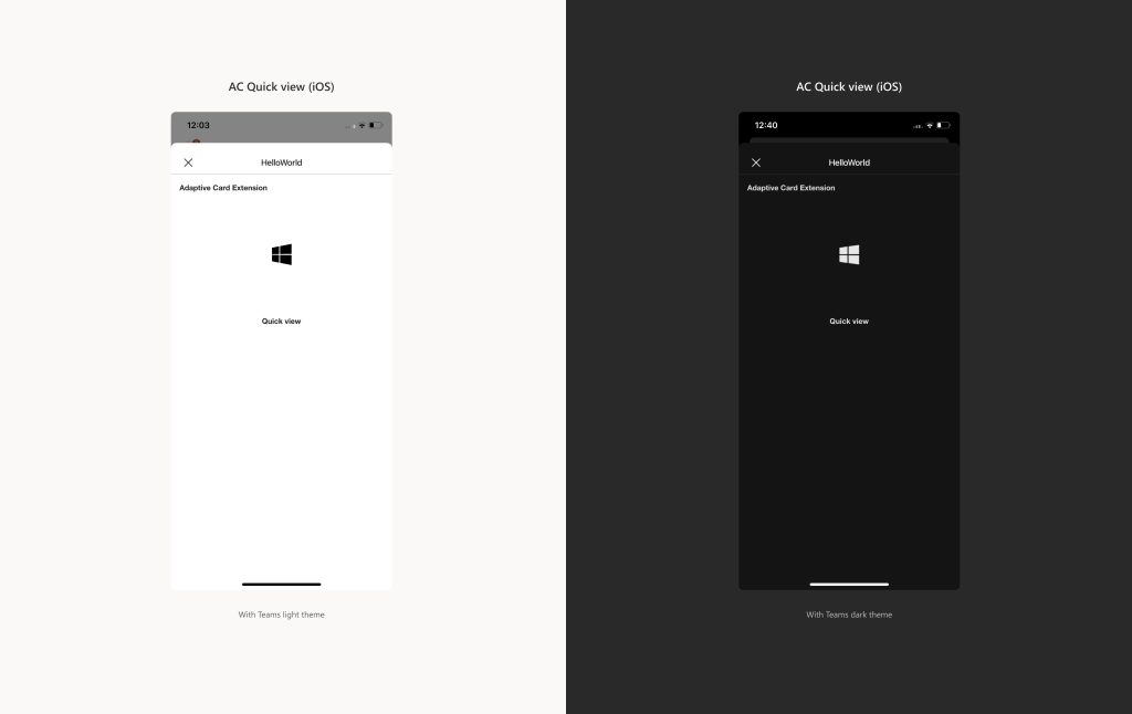
First of all, the audacity of some people. Second of all, remember that users have the option of changing themes on their apps. As a result, your beautiful adaptive card may look different to different users.
You can check the user’s theme in your adaptive card’s onInit function:
this.context.sdks?.microsoftTeams?.teamsJs.app.getContext().then((context) => {
    this.setState({
      theme: context.app.appInfo.theme
    });
  });
Important! Make sure you’re using at least SPFx v1.18, or you may be missing the sdks property in the context.
Now, you can render your card according to the current theme! You can read more about it here: Making Quick View compatible with dark mode in mobile devices.

I want to show some dynamic content on my card. How can I display SharePoint list items in quick view? Is there a way to pass them to the template?
Yes, of course! Firstly, reference your data in the quick view – for example, pass the values from the card’s state:
public get data(): IQuickViewData {
  return {
    items: this.state.items
  };
}
With that in place, you can refer to your items in the template. Remember that a parent container should have a “$data” property set:
{
  "type": "AdaptiveCard",
  "$schema": "http://adaptivecards.io/schemas/adaptive-card.json",
  "version": "1.5",
  "body": [
    {
      "type": "Container",
      "$data": "${items}",
      "items": [
        {
          "type": "TextBlock",
          "text": "${title}",
        },
        …
      ]
    }
}
And just like that, the card will display all your list items! As with the data property, the item properties are identified by the dollar character, for example, “${title}”.
It seems that adaptive cards don’t allow icons in their schema. I really want to use a Fluent UI icon on my card. What should I do?
Use an image instead! Either reference the pic’s URL:
{
      "type": "Image",
      "url": "https://adaptivecards.io/content/cats/1.png",
      "altText": "Cat"
    }
Alternatively, convert your icon to base64 format:
{
      "type": "Image",
      "url": "data:image/png;base64,iVBORw0KGgoAAAA…",
      "altText": "Cat"
    }
You can look online for image converters or try this clever CodePen solution.
Summary
I hope I’ve answered the most common questions that arise and will help you find your way around the world of Adaptive Card Extension. I’d love to hear what your tips and observations are about working with this tool 😊


Leave a comment