As design systems become a hot topic in the industry, it is worth taking a closer look at design tokens – a tool many design systems, including the world’s most popular Material Design or MUI, have introduced to optimize the implementation and management of UI components and a buzzword for what you, as designers and developers, might already be using in one form or another.
Regardless of your role – a designer, a developer, or a knowledge-seeking manager, this article will help you get an overview of what design tokens are.
I will briefly introduce their history, explain the concept and its application to design and code, the role they play in streamlining the design-development collaboration, and how that transfers to organizations managing their branding at scale.
If you still have no idea what I am talking about, no worries; this article will give you the basics to get started. Ready? Let’s begin.
But why design tokens at all?
As designers, we work towards answering user needs, as well as meeting certain business goals. Therefore, before we jump to explaining the article’s subject, I would like to focus first on the business matter design tokens tackle.
Looking at the world’s organizations, we can determine one thing they all have in common – branding. Developed at higher or lower levels, it is the visual language that differentiates one from another and allows them to communicate with their target audience in a particular manner.
In modern times, when industries rely on far more diverse channels than they used to in the past, considering not only printed media but a myriad of screen devices, design systems – codified brand languages – come to the aid of everybody involved in the process of creating communication to help maintain branding usage consistency.
We can safely say that your organisation’s branding is the pillar of its communication and a key factor in building your audience’s trust.
Let’s look at tokens as an example
How would one react to mailing or a website of an institution they trust their funds with, if they saw an outdated logo or interface colours not matching the visual language of the brand. Would it not seem odd and rather suspicious?
Now, to illustrate the importance of being able to apply branding decisions at scale, I am going to draw on a story that Louis Chenais once used.
Let’s imagine you are a designer at a large corporation. As the Head of Design, your new rebranding task is simple – it requires updating the main brand colour with a new one.
The rebranding is finalized, and you ‘only’ need to apply it across all the corporation’s product interfaces, which include:
- company’s website,
- a web app,
- an Android app,
- an iOS app.
‘No biggie,’ you think, excited about reaching the goal, and ask the managers of the relevant engineering teams responsible for each product to update the colour from X (the old one) to Y (the new one), providing them with RGB (colour space) values.
That is where it gets a little wild. You start receiving questions about other colour formats to work on different platforms, and people trying to determine if the update should affect all the UI components. Some managers are not even responding, which makes the update implementation in their areas doubtful.
Ensuring the correct application of this one change proves to be a daunting challenge without a common ‘design language’ both designers and developers could use.
So, what business problem do tokens solve?
Back in the day, large organizations wasted months on propagating branding changes to their digital products, which now provide products based on design tokens, taking minutes. What is the business issue that design tokens solve, then?
Long story short, design token implementation saves your organization’s money as you no longer need months and often hundreds of people’s work to implement simple design decisions into code across various platforms, risking inconsistency and negatively affecting your brand’s image.
Alright, design tokens… what?
Let’s take a step back to the birth of the concept of design tokens at Salesforce around 2015. Jina Anne on the design systems team, accompanied by Jon Levine on the engineering side, coordinated the conceptual, agnostic solution – a one-location design definition (the ‘Single Source of Truth’) propagated to all platforms – coining the term ‘design tokens.’
Design tokens are the names that are used to convey design decisions, such as:
- a colour,
- iconography,
- a typeface or a font size,
in the design language of your organization. To be used and understood by everyone, those names should be a result of common decisions made by designers and developers with consideration of their workflows.
We can describe design tokens as
(…) the visual design atoms of the design system — specifically, they are named entities that store visual design attributes.
Salesforce Lightning Design System
If you are not familiar with the Atomic Design Methodology, the following illustration depicts the concept on the example of the Instagram interface piece broken down from a page to actual atoms, placing design tokens as subatomic particles, meaning the values that atoms consist of.
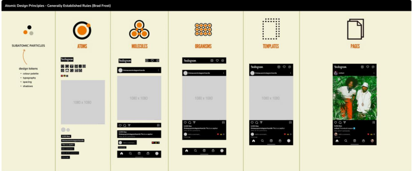
Design tokens are a language for communicating intent between disparate parts of a system.
Ethan Marcotte, “Design-ish systems“
And more clearly?
To better illustrate the concept, let me use a metaphor.
Imagine you have a dog. Your dog’s name is “Charlie,” but you also call him “Little Rascal” and “Muffin,” depending on the circumstance.
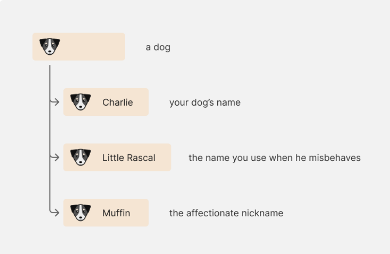
Regardless of what you call your dog, it’s still the same pet (contrary to what you may think when it has just destroyed your favorite piece of furniture). Design tokens work the same. In place of using hard-coded values – like hex for colour, pixel for spacing, etc. – you name those values. It is like giving nicknames to your design decisions. Let’s have a look at the colour analogy below.

Design tokens are intended to be used in your design system and across your products. To enable that, you need to transform them for use on various platforms (Web, iOS, or Android) by different teams.
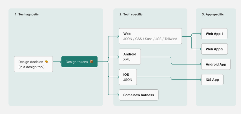
W3C Design Tokens Standard
If we want to ensure successful design token adoption in multiple apps, we need a standard securing consistency. The World Wide Web Consortium (W3C), led by Tim Berners-Lee and Jeffrey Jaffe, in cooperation with a plethora of organizations and individuals, works to provide the W3C Design Tokens Standard.
It would allow other tools to communicate in the same ‘language,’ for example, enabling tokens from Figma to be taken and used in Adobe Illustrator. Imagine how it would speed up the workflow between marketing and product design departments!
To learn more about the standard, please explore the Official Design Tokens Community Group and the W3C Design Tokens Community Group.
How do we build with design tokens?
Now that I have covered the absolute basics of the design tokens concept, why don’t we move further and dive a little bit deeper into different types of tokens and how they serve us to build designs?
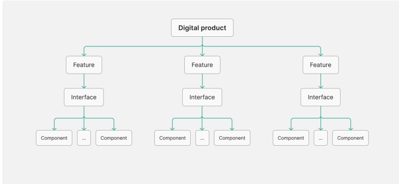
Each digital product is a structure of features that consist of interfaces. Every interface is built of components and composed of design tokens.
Let’s break down a button component. You can see all the elements that we would translate to design tokens.
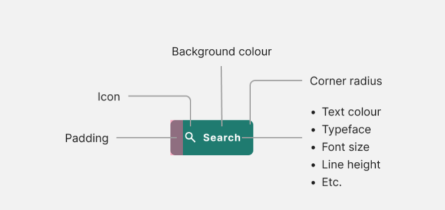
Some examples of design tokens
Here are some examples of common design tokens used in industry-standard design systems that you could encounter:
- Colour Tokens
- Primary Colour – used for primary branding elements and calls to action.
- Secondary Colour – complementary colour for accents and secondary elements.Neutral Colours – shades of grey used for backgrounds, borders, and text.
- Error/Warning Colours – distinct colours for indicating errors or warnings in the UI.
- Typography Tokens
- Font Family – primary and secondary typefaces used for headings and body text.
- Font Size – different sizes for headings, subheadings, body text, etc.Font Weight – variations in font weight for emphasis and hierarchy.
- Line Height – consistent spacing between lines of text for readability.
- Spacing Tokens
- Padding – standard padding values for buttons, cards, and containers.
- Margin – standard margin values for spacing between elements.
- Grid Spacing – a grid layout system’s spacing between columns and rows.
- Border Tokens
- Border Radius – standard border-radius values for rounded corners on elements.
- Border Width – thickness of borders around elements.
- Border Colour – standard colours for borders around elements.
- Shadow Tokens
- Box Shadow – standard shadow values for adding depth and dimension to elements.
- Text Shadow – shadow values for enhancing readability and contrast of text.
- Icon Tokens
- Icon Size – standard sizes for icons used throughout the UI.
- Icon Colour – default colour for icons or variations for different states (active, inactive, etc.).
- Animation Tokens
- Transition Duration – duration of transitions between different states or interactions.
- Animation Timing Function – easing functions for smooth animation effects.
- Animation Keyframes – keyframes for more complex animation sequences.
- Accessibility Tokens
- Contrast Ratio – minimum contrast ratio between text and background colours for readability.
- Focus Indicator – styles indicating focus on interactive elements for keyboard navigation.
- Screen Reader Text – hidden text for screen readers to convey information to visually impaired users.
Types of tokens
We divide tokens into three categories (types). Each token type signifies a level of assigned context.
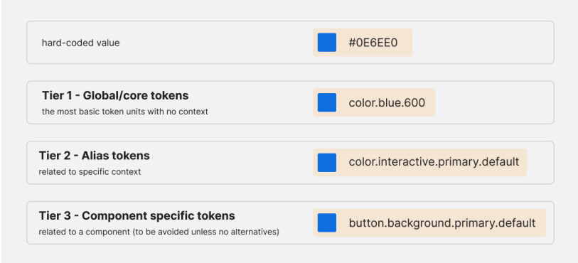
Global tokens
Tier 1 (global) tokens – primitive values – are basic, contextless units of a Design Token System.
Whether you are a designer, a developer, or a project manager, you probably work with the brand colours of your organization, and there is a high chance that you operate on the hex (or any other) values in communication regarding those colours.

Why is it not the most comfortable solution? Let’s see:
- unless you know your hexes by heart (and let’s be honest – you might be the only one in the organization), the hex code does not describe the actual colour, making it unrecognizable,
- it does not give any information about the design decision behind this colour (where it is supposed to be used, etc.),
- it is easy to misspell the hex, leading to visual inconsistencies within the product.
Global tokens are names you give, for example, to hex values, to give an initial, consistent, and contextless description of those values that would be understandable to everybody working with them. This allows avoiding any ‘fifty-shades-of-grey’ situations – accidentally ending up with several shades of your brand colour used in your product.

According to the scheme above, naming your hex value ‘colour.blue.600’ instead of using the hex value benefits you in several manners:
- colour is easily recognizable now,
- tokenized value is now defined as a variable in code, so any misspelling will be signaled as a code error.
Despite the obvious advantages of using global tokens, this is still not the perfect solution, and relying only on this type of token does not convey information about use cases of the colour nor allows automated, narrowed-down colour changes, affecting only particular groups of components. Instead, the dev team would have to look for suitable use cases and change the colour manually. What a waste of time, right?
Alias tokens
Here comes the next design token type. Tier 2 (alias or system) tokens – context-specific names referring to design decisions behind values (what they ‘do’).
#0E6EE0, now called ‘colour.blue.600′, will also exist in the system under different aliases, depicting its use cases. For example, ‘colour.interactive.primary.background’ would mean this colour is supposed to be used for the background of primary, interactive UI elements.
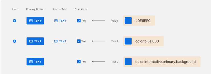
As you can see in the example above, in case of any colour change, this operation would only affect the background of the primary interactive elements of the user interface, eliminating those without a blue background.
Introducing alias tokens to code results positively in:
- elimination of possible mistakes when copying to code (just like global, alias tokens are variables in code as well),
- making the token’s purpose clear to both design and dev teams,
- speeding up the update process significantly, enabling devs to update component properties at a large scale easily,
- empowering developers and designers, allowing detection of potential incorrect use of properties (like text colour applied to icons) and correcting such errors by developers themselves or in communication with design,
- making designers rethink the need for additional values, such as colours, in the design system, reducing potential clutter and unnecessary system complexity.
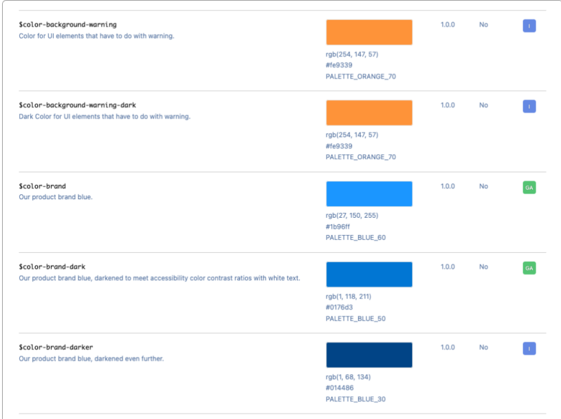
When should you reach for alias tokens?
- For example, tokenizing every colour across your design system would result in a giant global token set to maintain.
- If global tokens apply to text, icon, background, or border across multiple pages.
- If you have a multi-brand/theme/mode design system.
Example:

Of course, using alias tokens comes with the responsibility of maintaining a larger set of colours and requires thorough and thoughtful system planning; however, in the long term, the perks prove to be worth the additional effort.
There are cases when it is not advisable to rely on alias tokens. For example, if there is a colour that you need to use in your product, but it is not part of your brand’s visual language, or it would be used only once or for one particular UI element that should not be affected by global design decision changes.
Component specific tokens
For unique UI elements, it is appropriate to use Tier 3 (component-specific) tokens dedicated to distinct components and their properties.
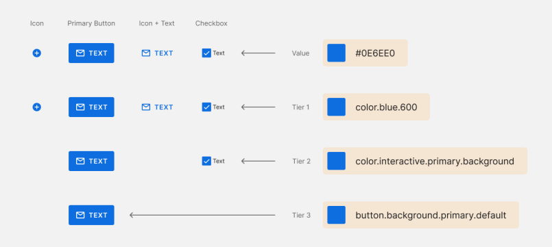
All of the above names (design tokens) mean the same hex value but in different contexts or regarding a different design system component – when you apply component-specific tokens, any possible design decision changes – e.g., colour updates – applied to it will affect only this component and the property the token refers to. In our case, it would be only the background colour of the primary button in its default state.
As you can see on the diagram below, where I switch blue to pink, this is how tokens allow me to be specific about design decision modifications. You can apply particular changes (like colour) to selected tokens, affecting only particular UI elements.


Okay, but how do we come up with token names?
I will not tell you exactly what naming convention to aim for when establishing a tokens system for your product, as it should be tailored to your product’s specifics and team preferences. Naming takes time, as teams need to invest effort into finding the perfect logic for them. Although looking for inspiration in open design systems is good, you need to remember that what works for one product does not necessarily have to be an ideal solution for yours.
I will not elaborate too extensively on token naming, as it is a vast topic, worth in-depth exploration once you embark on a design token system building journey. However, let me share some good practices to consider while developing a design token naming system that would serve an organization well.
Token names – best practices
Most importantly, token names should be:
- as short as possible – to not overcomplicate the system,
- meaningful – to communicate design decisions clearly,
- easy to understand – for easy orientation and potential onboarding to the system,
- modular – for simplicity of building the system,
- consistent – to reflect the design system properly and facilitate understanding of the naming convention.
When setting a naming convention for alias tokens, a good start will be building names about:
- category – the attribute a token refers to, e.g., colour, typography, spacing, shadow, border radius, etc.,
- concept – a situation a token describes, e.g., Information, warning, success, etc.,
- purpose (property) – where in your UI a token will be used, e.g., text, icon, background, border, heading, body, etc.,
- variant – potential variants of a token, e.g., states (active, inactive, disabled), sizes (XL, L, M, S), etc.,
- component (to be avoided unless specifically needed) – a component that will be affected by a token, e.g., button, checkbox, link, etc.
Token names – examples
Such convention could look like this:
Category.purpose.variant
For example:
Colour.background.active
(describing the design decision made to assign a particular colour to the background of active UI elements)
Next, you should focus on providing as much context as you can. Remembering that keeping token names as short as possible is worth making a token name a bit longer if it reflects the design decision well. After all, design tokens are not UI elements that end users would see but text information stored in code that developers operate on. Therefore, the more context they convey, the better.
Design token naming conventions, especially those for multi-brand design systems that require multiple themes (visual language sets, e.g., specific brand colours, typography, iconography, etc.), may consist of many naming levels.
For instance, if you need to distinguish tokens across brands in your design system, you may need to introduce product namespacing, which might look like this:
brand.product.colour.information.background Namespacing allows developers to distinguish tokens in code and operate on them more comfortably.
We have the system established. How do we manage it all together?
Now that you know the basics of the design tokens concept and token naming conventions, it is time to present how using them streamlines design-dev collaboration.
For better contrast, let me introduce you to the design handoff process in its classic shape, with no use of design tokens.
Classic process
Commonly, we complete the following handoff steps:
- The designer delivers the UI design in Figma (the most popular collaborative interface design tool).
- The designer prepares UI specs (design documentation with handoff notes for dev).
- The designer hands off the design file and has a call with the developer/dev team, who will be implementing the design, to discuss the specifics.
- Developers inspect the file and start coding.
It seems quite simple at this level, considering the design will never change. However, product design is about evolution, and design changes are inevitable. Therefore, the above process does not end on the fourth step. Over time, as the brand evolves, there are more steps:
- Let’s say the brand colour changed, and the designer needs to update the design; let developers know so they can update the code accordingly.
- There are also times when developers need to change something in the code, so they need to inform the designer to reflect those changes in the design.
The more steps and iterations, the more space for mistakes. And let’s be honest, overall, this amount of communication back and forth for just one colour update is a lot considering the daily workload.
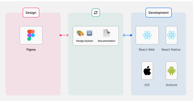
We want this process to be as simple and automated as possible (like on the diagram below) to save valuable time for both design and dev teams.
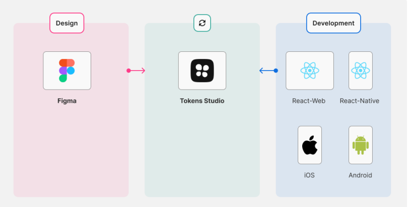
Introduction of design tokens
This is why introducing design tokens to the design-dev workflow is a game changer. Let me walk you through how we manage tokens and what a handoff involving them might look like.
Assuming we have already brainstormed with developers and come up with the best naming convention to serve us all. We have tokenized the design system (translated design decisions – like colour usage for particular purposes – to tokens), we maintain and manage design tokens in one place (our single source of truth). This can be done using various tools and technologies. However, selecting the ones that best fit your team’s workflow and target platform requirements and limitations is essential.
Since Figma is our main tool of the trade and we hand designs off to devs as Figma files as well, it is key for the optimal workflow that we operate on design tokens in our native environment and that tokens used in code also find reflection in the designs that we pass on to development.
Tokens in Figma
In April 2024, in Figma, we are able to use tokens in two ways.
The first one incorporates the Tokens Studio for Figma plugin, which started as a tool to bridge the gap between Figma and code. It is a central place for designers to maintain a multi-brand/mode/theme design token library and seamlessly sync between design and code.
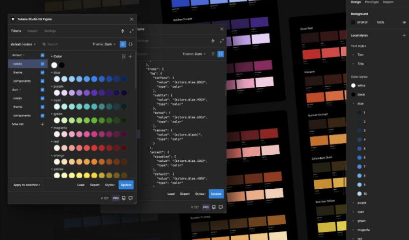
Designers can easily build, store, and manage their design systems there. The plugin allows the application of the tokens to design elements, syncing between the plugin and Figma-style libraries. We can also sync with a remote repository, which streamlines the cooperation with developers as we do not need to even leave Figma to forward any system changes to the dev team to update code.
Of course, it is not a perfect solution from the design standpoint, as we need to rely on the plugin instead of being able to apply design tokens directly via the Figma UI.
Being a dynamically developed and updated software, in 2023 at their annual product conference, Figma unveiled variables, providing designers with ability to establish design systems directly within the Figma app.
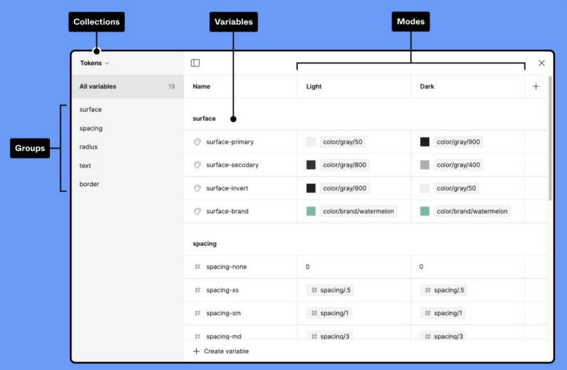
Figma does not fully support typography and text related tokens in variables yet, however we are able to store those tokenised properties as styles and effects directly in the app (still using the same naming as developers would in code). We expect variable support in this area to be introduced soon as well.
Depending on the type of Figma licensing plan, we are capable of exporting tokens directly from Figma either, using an additional dedicated plugin to export a .json file (that might be imported to other Figma files and used by developers) or sync directly between Figma files (option available with the most advanced Figma licence plan).
Once we have our design tokens workflow established on Figma level, to propagate those tokens across your organisation’s platforms, you will need to transform them, for example with the most popular transformer – Style Dictionary (by Amazon), which allows converting design tokens to CSS variables.
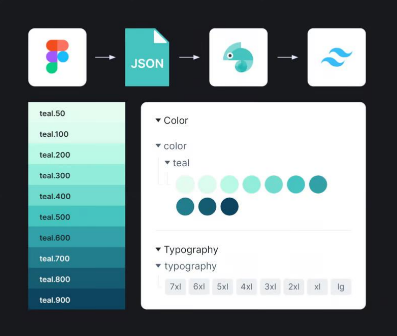
For better understanding, let’s have a closer look at the process of adapting design tokens to a form consumable by the downstream applications.
Design tokens are exported by Tokens Studio in a .json file structure. I already mentioned that the Tokens Studio plugin is able to link directly to a remote repo (GitHub for example), which means that a designer can push changes to and pull from the master repository. It plays significant role in speeding up our workflow, since we do not need to manually export a .json file and forward it to the dev team to upload to the repo, which would require additional communication and time.

Having a working JSON structure, Style Dictionary is fully capable of meeting your requirements. Once it translates raw JSON data into a format specific to a platform, it can generate various output formats.
To give you an example, you would use Style Dictionary to translate values from RGB in .css for web to RGBA in .json for iOS or to 8-digit hex (AARRGGBB) – for Android platforms.
For even more consistency, teams often decide to not only store components in Figma, but use Storybook as well.
Storybook is an opensource frontend workshop environment for building UI components and pages in isolation – it is a library that stores design system including brand’s visual language, components and patterns. Since it functions outside of the main app, it can serve as a playground, allowing for building components regardless of the dependencies or the app’s requirements.
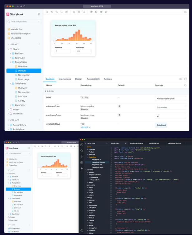
Many top companies and design systems, like IBM Carbon, Shopify Polaris, etc., use Storybook, benefitting from its multiple advantages:
- providing variables for the common CSS preprocessors,
- an XML format for Android,
- a JSON for iOS (you do not get that particular format by only exporting from Tokens Studio plugin).
- one source of truth, reflecting design in actual coded components,
- streamlining documentation, as you do not need to be a code expert to contribute and be able to maintain up-to-date documentation effortlessly; moreover, developers are able to provide context to components – ensure documentation of the best use and possible limitations before implementing the component,
- allowing real time design-dev collaboration and awareness of whether the component is live or in building thanks to component status plugin,
- facilitating design-dev communication.
Such workflow, enabling you to translate design language into styles formatted to suit specific platform requirements, proves to be a scalable, technology-agnostic solution that is agile enough to accommodate any future direction changes for your organisation or product.
What are the improvements based on?
How would the initial classic workflow be elevated using design tokens?
- The designer finishes an interface design in Figma.
- All the information is already covered by design tokens, so the designer does not need to deliver complicated UI specs documentation, covering spacings, colours for particular button states, etc.
- The handoff calls are shorter or unnecessary at all, as design decisions regarding styling are already tokenised and stored in Storybook, being easily accessible to everyone.
- The dev team can inspect the file and implement the design seamlessly.
What if there is a need of any change to the design, for example the brand palette needs updates? It is simple – a designer or a UX engineer updates the token system in the source, either exporting a .json filecor pushing changes directly to the repository. Devs take over and automatically propagate updates to code. So easy!
What design tokens ultimately give us?
To summarise, let me highlight several overall key benefits that using design tokens brings to you and your team.
Solid foundations
Steady design system, where decisions are well thought through and consistent. Implementing design tokens requires design system adjustments for proper functioning – you need to provide proper system organisation and UI element architecture. Moreover, a clear and understandable visual language is of great value for a brand to be able to communicate well and build trust.
Communication in the same language
Imagine that you are Head of Design again and you need to execute a colour update in your product existing on several different platforms. You no longer need to use several different values (HEX, RGB, RGBA, etc.). You do not risk any mistakes upon propagating colour values to code. In design-dev communication you rely on the common naming convention that is understandable to everybody and elevates day-to-day workflow.
Easy system maintenance
In case of any design decision changes, you do not update every output package or a design system-related file separately. You edit in one place and it all gets updated at once securely. Managing a multi-brand/themed system is easy now and you have full control over the scale of change application.
One source of truth
With a design token system, you have all your files and repositories synced. Potential changes no longer require you to communicate them to every product manager. Instead, you (or a UX Engineer responsible for that task) update tokens in the system, push the change to the repo and let developers handle it from there, being sure they have accurate information. Your designs will not be sacrificed because developers fail to correctly implement your work, nor will there occur inconsistencies across different platforms your brand exists on.
Proper methodology to collaborate between teams
Design and dev teams agree on a naming convention, a tool set most appropriate for your workflow and product, as well as system maintenance rules to obey. This allows process automatisation and streamlines design-dev collaboration significantly.
All in all…
Design tokens are a powerful tool, allowing for enhanced product teams collaboration, as well as brand consistency at scale across multiple different platforms. Surely, it is not a one-year-trend, and we will be hearing more and more of them.
It is worth thinking of introducing design tokens to your product, when:
- as a designer, you no longer want to see your work implemented incorrectly and you would like to handle a design decision comprehensively – from decision to deployment – seeing consistent visual language across platforms you design for,
- as a developer, you are tired of manually applying design changes and values updates and you want to upgrade your experience of managing styles,
- as a manager, you are fed up with all the styling bugs reported and you wish for design and dev to collaborate on a common ground at scale.
For me personally, it has been extremely exciting to embark on the design tokens journey together with the UX Engineer and the Engineering Team I work with daily. It is already visible how our collaboration elevated just by searching for a common ground.
If you find the object of the article interesting, I encourage you to explore further with the help of The Ultimate Design Systems Resources List.
Bibliografia
- ‘WTF are Design Tokens’ a great video by Jina Anne
- A wonderful, simple video on design tokens by Hiro Matsui
- ‘Living Design System’ by Sönke Rohde
- Adrián Guerrero’s article about design tokens
- ‘Supercharge your Design System with Design Tokens’ by UX Collective Jishnu Hari
- ‘Evolution of design tokens and component styling, part 1’ by Brian Heston
- ‘Design Tokens 101’ by Romina Kavcic
- ‘What Are Design Tokens?’ on STUDIO by UXPin
- ‘Design tokens’ by The Design System Guide
- ‘Design tokens for dummies’ by Louis Chenais
- ‘Brief History: Design Tokens’ by Maxwell White
- Introduction to design tokens by Louis Chenais
- ‘Piping Design Tokens from Figma’ by Tyler Mathes
- ‘Converting Design Tokens to CSS Variables using Style Dictionary’ by Anna Popova
- The Design System Guide
- ‘Spotify’s rebranding journey, based on design tokens’ by Shaun Bent, Marina Posniak, Gerrit Kaiser
- Figma’s resources on variables
- Figma’s guide about the difference between variables and styles




Świetny wpis Kasiu! Bardzo wyczerpująco przedstawione zagadnienie. Sama jestem fanką systematyzacji pracy nad projektami i tak naprawdę uważam, że wszyscy korzystają z tego układu, a najbardziej projektant,bo tokeny w jego imieniu czuwają nad przejrzystością, spójnością i estetyką. Dużo się dowiedzialam, dzięki!