Designing reports/dashboards/Business Intelligence (BI) applications is a vast topic. This stage of implementation is often treated hastily, with lower priority. We allocate little time to it due to deadlines or limited budgets. But should this be the approach to reporting? Should analytics be treated as a lower priority, often relegated to second or third place?
Reporting is the primary tool for improving our business, enhancing quality, breaking new barriers, and evolving. Of course, it doesn’t replace operational work, which is the foundation of a thriving enterprise, but with an efficient reporting system, we can find answers to questions:
- Where?
- When?
- How?
And make decisions that can steer our business in the right direction.
One of my favorite quotes,
Everything is designed. Few things are designed well.
Brian Reed
perfectly illustrates the often overlooked approach, whether in projects or every aspect of our lives.
We want our reports to be modern, colorful, “fancy & sexy,” often forgetting what we need, how we will use them, and what stories they should tell us. By answering these questions, we begin the process of designing the report. It requires an understanding of business needs, but unfortunately, it also requires time, which is crucial here. Sometimes, “designing” takes longer than the actual “development.”
In this post, I’ll present a simple approach I often use in my work. Of course, there are many approaches, but this one is so natural to us that it’s often overlooked.
The capabilities of our brain
Data arrangement
Few people realize our brain’s potential in reporting and this organ’s crucial role in perceiving data. It’s worth leveraging its natural behavior when designing and creating reports/dashboards.
It’s often said that the simplest solutions are the best, so our brain guides us on how we should place the most essential information and where the less important ones should go based on tendencies we possess:
- we read from left to right,
- we read from top to bottom.
This is a natural process in which we participate without fully realizing it’s obvious.
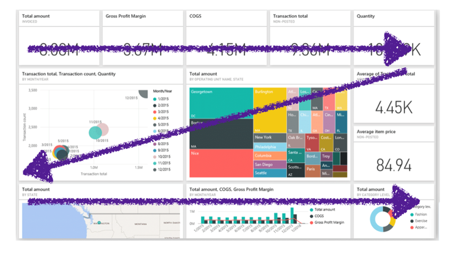
Analytics is meant to assist us in making important business decisions, so it’s crucial where data will be located and how quickly we can make strategic decisions with their help.
Granularity of data
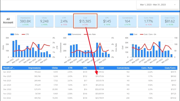
Considering the conditions of our organism, we should start building our report/dashboard from the smallest granularity of data to the largest. It’s important to consistently move from one piece of information to another, so it’s worth, for example, starting by providing critical information in the form of KPIs at the very top of the report, which will immediately show us important, measurable, strategic data for our company.

Then, the data should become increasingly precise, containing more information in the form of charts, for example, allowing us to quickly determine a reference point or cause or perhaps show that it was just an isolated case. But why was it that one case? Such data is already worth analyzing in several ways, factors in greater granularity of data for which a table is ideal.
Below is a mock-up of a dashboard that progresses from the lowest granularity of data, critical, and key information to the highest to analyze the entire situation.
Visual perception – contrast
Our brain is capable of remembering a lot. However, how can we make sure that important information is noticed automatically? Contrast is often a crucial aspect of visualization. Thanks to it, we can quickly distinguish from “others” and remember.
A simple example below.
How many “5”s can you remember in Fig. 4?

And how many in Fig. 5?

There is no need to add more; thanks to contrast, we can analyze the above data quickly and know the answer to the question asked.
Visual perception – color
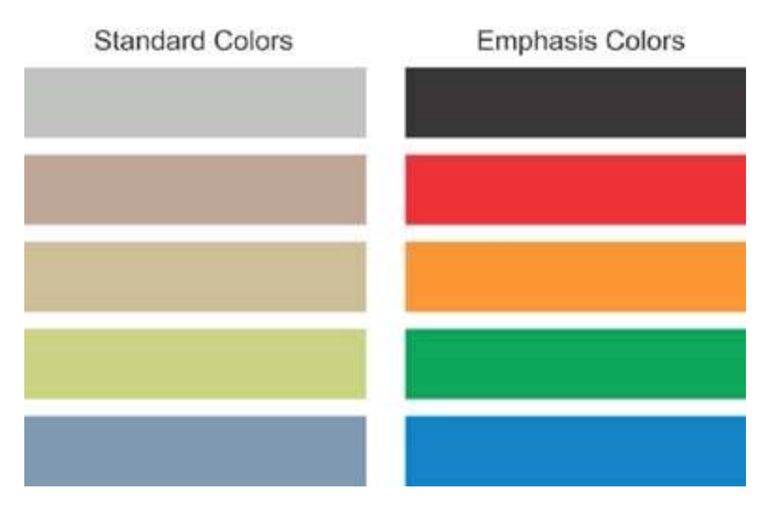
Another aspect of visual perception may be color. It is natural for humans to perceive the color red/yellow/orange as informing us, for example, about stopping, checking if everything is okay, and exercising caution. On the other hand, the color green is perceived as something good.

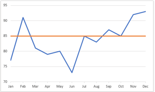
In reporting, this is referred to as conditional formatting – when we present data in a clear, natural manner, sometimes requiring emphasis that specific data deviates from our expectations negatively or positively. Standard colors are not a natural “alarm” for us that something needs our attention. However, for example, red/orange should already catch our eye, and we can display important information such as “Target” and its performance, as shown in Fig. 8.
The most straightforward solutions are the best
Often, simple solutions are the best. I hope the above examples demonstrate that small, manageable changes in report design immediately make reports more transparent and readable.
The presented examples are just a glimpse into designing analytical solutions. There are many ways to present data depending on our brain’s or eye’s perception, such as:
- appropriate size,
- orientation,
- shape of components, visualization.
Additionally, report segmentation should be done based on the needs of different user groups, such as management, key users, or analysts.
Without knowing these techniques, we can rely on various standards in the BI world. One is IBCS – International Business Communication Standards, where we can find the best practices for good visualization design.
***
If you are interested in the topic of business analytics, be sure to take a look at other articles by our experts as well.








bardzo trafne uwagi.
Doskonały artykuł