Accessibility tools, such as TalkBack, use a semantics tree to learn the hierarchy and parameters of elements. Therefore, developers have no direct control over accessibility interfaces (what Talkback reads). It is the developer’s job to provide the appropriate context and user interface information for accessibility services.
Semantics tree
Since the plan composing functions displayed as UIs are not exactly hierarchical, accessibility tools have no way to identify a specific component after the UI is emitted. The solution to this problem is a semantic tree constructed with a composition tree. The difference is that the semantic tree is accessible via accessibility services such as TalkBack.
A developer can define specific semantic properties, this is done by
Modifier.semantics()
How does semantics help with accessibility?
As described above, semantics provides TalkBack and other accessibility tools with the context of elements on the screen and their properties.
Semantics are covered by most of the compose elements. There are also ways to override them or extend them. You can clear semantics with:
Modifier.clearAndSetSematics()
or merge parent with child elements with:
Modifier.semantics( mergeDescendants = true ) {}
Most commonly used sematic properties and patterns
The following describes accessibility solutions and approaches I came across while working on UI in a large banking application in Compose.
Logically single element
Whenever an element consists of multiple UI elements, but presents itself as logically one, it should be displayed to accessibility tools ale single. Example below:
@Composable
fun ListItemWithAvatar(painter: Painter, text: String) {
    Row(
        modifier = Modifier.semantics(mergeDescendants = true) {
        }
    ) {
        Image(painter = painter, contentDescription = null)
        Text(text = text)
    }
}
On image below shown version with mergeDescendants = true and mergeDescendants = false

Clickable and selectable elements

Compose provides specific modifiers that support all required semantics for clickable and selectable elements.
fun Modifier.clickable(
    interactionSource: MutableInteractionSource,
    indication: Indication?,
    enabled: Boolean = true,
    onClickLabel: String? = null,
    role: Role? = null,
    onClick: () -> Unit
)
fun Modifier.selectable(
    selected: Boolean,
    interactionSource: MutableInteractionSource,
    indication: Indication?,
    enabled: Boolean = true,
    role: Role? = null,
    onClick: () -> Unit
)
Note that their use depends on the element type. For example, if you have set SemanticsProperties.Text or SemanticsProperties.ContentDescription, you probably do not want to add onClickLabel. You can see this in the compose button implementation, where onClickLabel is predefined as null.
Expandable content description
Those options can be used with accordions, expandable texts and other expandable elements. When an element expands visually and reveals other elements on the screen, it should be marked in semantics in an appropriate way. Semantics provide two predefined actions that are displayed in the context menu when you focus on an element. These actions are:
fun SemanticsPropertyReceiver.expand(
    label: String? = null,
    action: (() -> Boolean)?
)

Modifier.semantics { this.expand(label = "Show full text") { expandNode() } }

fun SemanticsPropertyReceiver.collapse(
    label: String? = null,
    action: (() -> Boolean)?
)

Modifier.semantics { this.collapse(label = "Show collapsed text") { collapseNode() } }
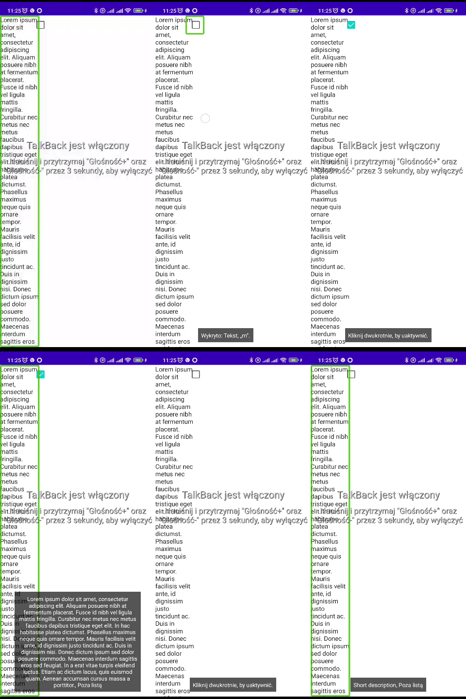
I have come across many times functionality where I want to allow content to expand and collapse, but only for accessibility purposes, for example, a long agreement near a checkbox. Below is an example implementation:
@Composable
fun ExpandableContentDescription(painter: Painter, text: String) {
    var isExpanded by remember { mutableStateOf(false) }
    Row(
        modifier = Modifier.semantics {
            contentDescription = if (isExpanded) LONG_TEXT else "Short description"
            customActions = mutableStateListOf(
                if (isExpanded) CustomAccessibilityAction(
                    label = "Read short text",
                    action = { isExpanded = false
                    true }
                ) else CustomAccessibilityAction(
                    label = "Read full text",
                    action = { isExpanded = true
                    true }
                )
            )
        }
    ) {
        Text(text = LONG_TEXT)
        Checkbox(checked = isChecked, onCheckedChange = onCheckedChange)
    }
}
Below is a gif with a demonstration of a full and short contentDescription:

Progress bars

Semantics allows you to set progress bar range information with data like current value, range and optional steps.
SemanticsProperties.ProgressBarRangeInfo
class ProgressBarRangeInfo(
    val current: Float,
    val range: ClosedFloatingPointRange<Float>,
    /*@IntRange(from = 0)*/
    val steps: Int = 0
)
In the case of a progress bar where the current progress or range is not known, indeterminate should be used. Loading animations should be used with indeterminate progress bars.
Modifier.semantics { progressBarRangeInfo = ProgressBarRangeInfo.Indeterminate }
After focusing on Progress Bars with appropriate semantics, TalkBack will signal changes in the current value with a sound and inform you when the current value reaches the end of the range.
Live regions
Live regions allow you to specify the elements that the accessibility tool should automatically notify you of changes to an element. Live Regions provides two modes:
- polite – which will wait for other messages to finish,
- assertive – which will stop other messages.
Marking a node with a Live region mode provides information to the accessibility service, which should notify the user when the text or content description changes. Examples include pop-ups used on the screen or a countdown when some action occurs after the timer ends.
Modifier.semantics { liveRegion = LiveRegionMode.Polite }
Text
Text should be handled by compose in most cases when you use Text() function:
Modifier.semantics { this.text = AnnotatedString("example text") }
Texts representing headlines should be marked with appropriate semantic properties:
SemanticsProperties.Heading
By calling method:
Modifier.semantics { heading() }
This allows accessibility readers (for example, talk back) to navigate from headline to headline.
Collection items and selectable groups

The container for the collection should set the Info properties of the collection:
Modifier.semantics { collectionInfo = CollectionInfo(rowCount = 10, columnCount = 10) },
Accessibility services should announce to user that focus enters collection. Elements in collection should set
Modifier.semantics {
    collectionItemInfo =
        CollectionItemInfo(rowIndex = 2, rowSpan = 1, columnIndex = 2, columnSpan = 0)
}
Accessibility services should inform the user that the element is located in the collection.
There is an automated approach to counting elements, rather than just having a developer manually provide them:
SemanticsProperties.SelectableGroup
Selectable groups will be announced based on child items number. Note that for Lazy containers a number of elements won’t be available.
Read order

There is a way to suggest the Ui focus path directly to the accessibility services. This can be performed by using a traversal group and setting custom traversal on child items:
SemanticsProperties.IsTraversalGroup
For child items:
SemanticsProperties.TraversalIndex
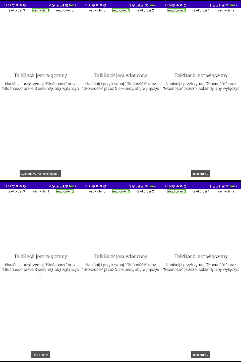
Should be set. Example of usage:
Row(
    modifier = Modifier.semantics { isTraversalGroup }
) {
    Text(" read order 3", modifier = Modifier.semantics { traversalIndex = 1f })
    Text("read order 1", modifier = Modifier.semantics { traversalIndex = -1f })
    Text("read order 2", modifier = Modifier.semantics { traversalIndex = 0f })
}
Roles
Roles provide accessibility services with information about specific types of Ui elements:
Modifier.semantics { role = Role.Button }
Custom Actions
Custom actions are a way to give accessibility services an additional way of control. These actions are available from the context menu. The user can activate them after focusing on an item. Below is an example of their use:
Modifier.semantics {
    customActions =
        mutableStateListOf(CustomAccessibilityAction("example action") {
            // your action
            true
        })
}
An example of custom action can be found in the Expandable Content Description section.
Error and Disabled state
Error is a file that explains to the accessibility service the input error, for example, a text file where the user entered an invalid E-mail should be marked as an error with a message explaining the problem.
Modifier.semantics { error("Description of error") }
Disabled is a simple state that should allow the accessibility service to focus on a specific element and inform you when that element is disabled.
Modifier.semantics { disabled() }
Accessibility tools
Android provides a semantic tree for all range of accessibility tools. The most well-known is Talk back, but there is also switch access, which allows you to control devices with just two actions (next, select). When developing interfaces, it’s worth remembering that the keyboard and mouse are great control devices for some users. Using the mouse is mostly straightforward, especially when you don’t need the hover effect and focus only on clicks. The keyboard requires additional code, but can speed up navigation when using switches on the keyboard.
Testing semantics
There are two approaches to automated testing:
- snapshot tests – these are limited and focus mainly on testing areas of focus with the text that will be delivered to accessibility services.
- instrumental tests – allow you to check a set of semantic properties.
Snapshot
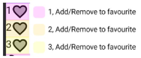
Snapshot tests are based on rendered images. Testing simply involves checking pixel-by-pixel the currently generated images with a “golden” image. In these tests, accessibility elements can be added to generated images. Here is an example:

A great library for snapshot testing is Paparazzi.
Add the dependency to the project’s build.gradle file:
dependencies {
    classpath 'app.cash.paparazzi:paparazzi-gradle-plugin:1.3.1'
}
And use the plugin in the module’s build.gradle file:
plugins {
    id 'app.cash.paparazzi'
}
Now, we can start creating snapshot tests. Create a class for the unit tests:
class ExampleUnitTest {

    @Test
    fun test() {    }
}
Add a rule to initialize paparazzi:
@get:Rule
    val paparazzi = Paparazzi(
        deviceConfig = PIXEL_5,
        theme = "android:Theme.Material.Light.NoActionBar",
        renderExtensions = setOf(AccessibilityRenderExtension())
    )
And create a test function:
@Test
fun test() {
    paparazzi.snapshot {
        Content()
    }
}
The above code will generate and compare with a golden snapshot of Content() composable.
To generate the golden snapshots run:
./gradlew recordPaparazziDebug
By default, this command creates snapshots in src/test/snapshots.
To compare the golden snapshots with the current version, use the command:
./gradlew verifyPaparazziDebug
The configuration parameter responsible for adding the semantics properties of the graphical representation is:
renderExtensions = setOf(
    AccessibilityRenderExtension()
)
However, this will only display a few semantic properties, such as text, contentDescription, action labels. For example, progressBarRangeInfo won’t be shown.
Instrumented
Instrumented tests are tests performed on Android devices. Jetpac compose provides a library for testing compose. Let’s see an example:
Add a file to build.gradle module:
   androidTestImplementation("androidx.compose.ui:ui-test-junit4:$compose_ui_version")

    debugImplementation("androidx.compose.ui:ui-test-manifest:$compose_ui_version")
Create a class for the instrumented test:
class MyComposeTest {

    @get:Rule
    val composeTestRule = createComposeRule()

    @Test
    fun myTest() {
        // Start the app
        composeTestRule.setContent {
            Content()
        }

    }
}
Then you can test any semantic property by creating a matcher for it. Below is an example for indeterminate progress bar information:
fun hasIndeterminateProgressBarInfo() = SemanticsMatcher("Node is not indeterminate progress bar range info") {
    it.config.getOrNull(SemanticsProperties.ProgressBarRangeInfo) == ProgressBarRangeInfo.Indeterminate
}
And use it like:
composeTestRule.onNodeWithTag("Example tag").assert(hasIndeterminateProgressBarInfo())
Similarly, you can perform assertions on any semantic property, even a custom one.


Leave a comment